

In April 2026, I closed a fully remote chapter, and decided to update this visual presentation with everything that I have learned since 2022 —which is a lot!
My seven-year-old grandson sleeps just down the hall from me, and he wakes up a lot of mornings and he says, “You know, this could be the best day ever.”
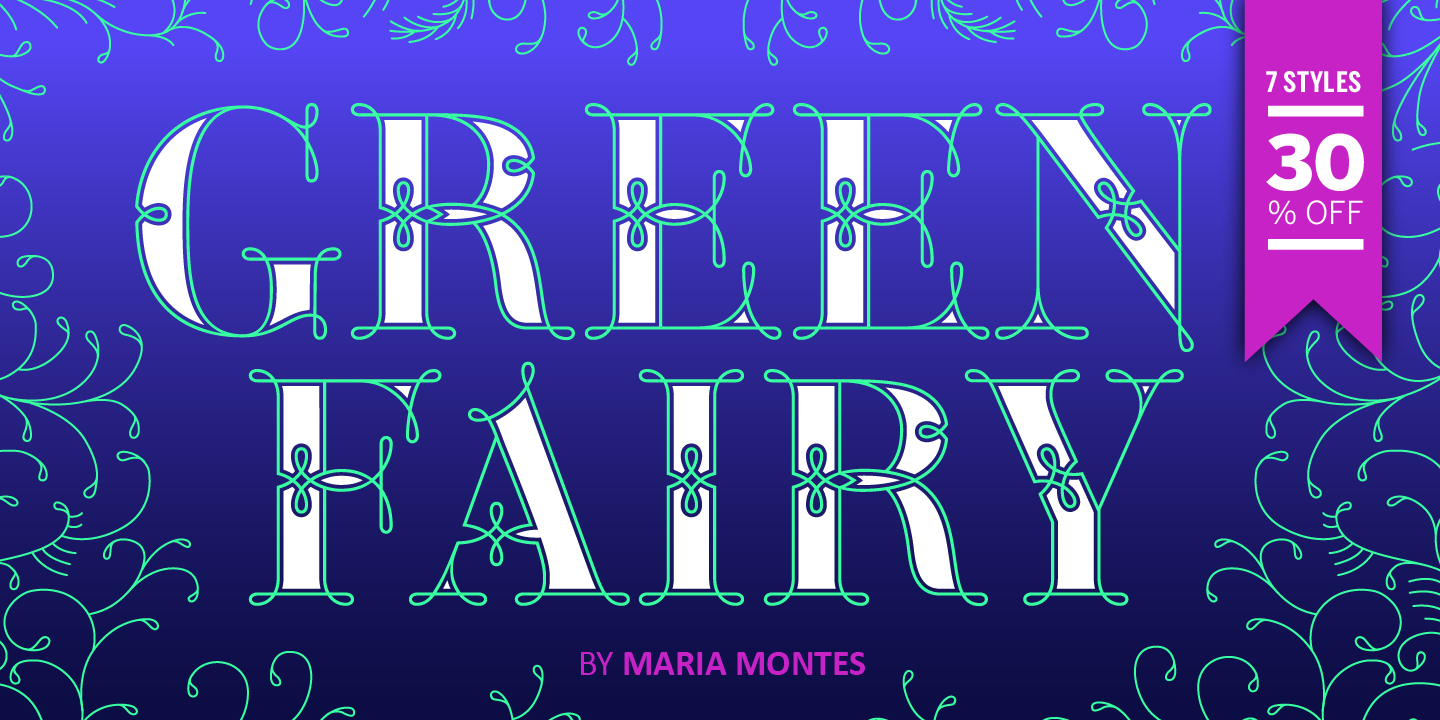
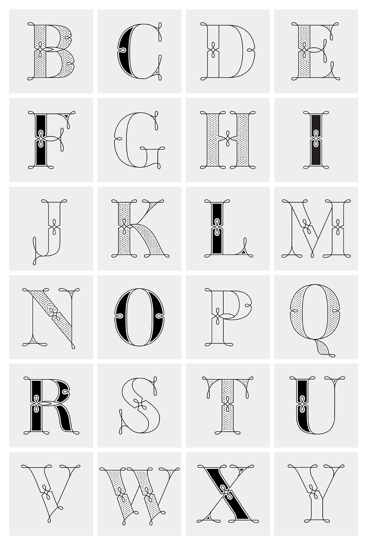
This article is an ongoing resource of fonts designed by women, as well as supporting material to learn more about female and non-binary graphic & type designers.
Barcelona for graphic designers is my on-going list of resources for any creative visiting this city for the first time(s). Every recommendation is only personal, and it comes with its location and a hyperlink to their website, Google map or Instagram account.
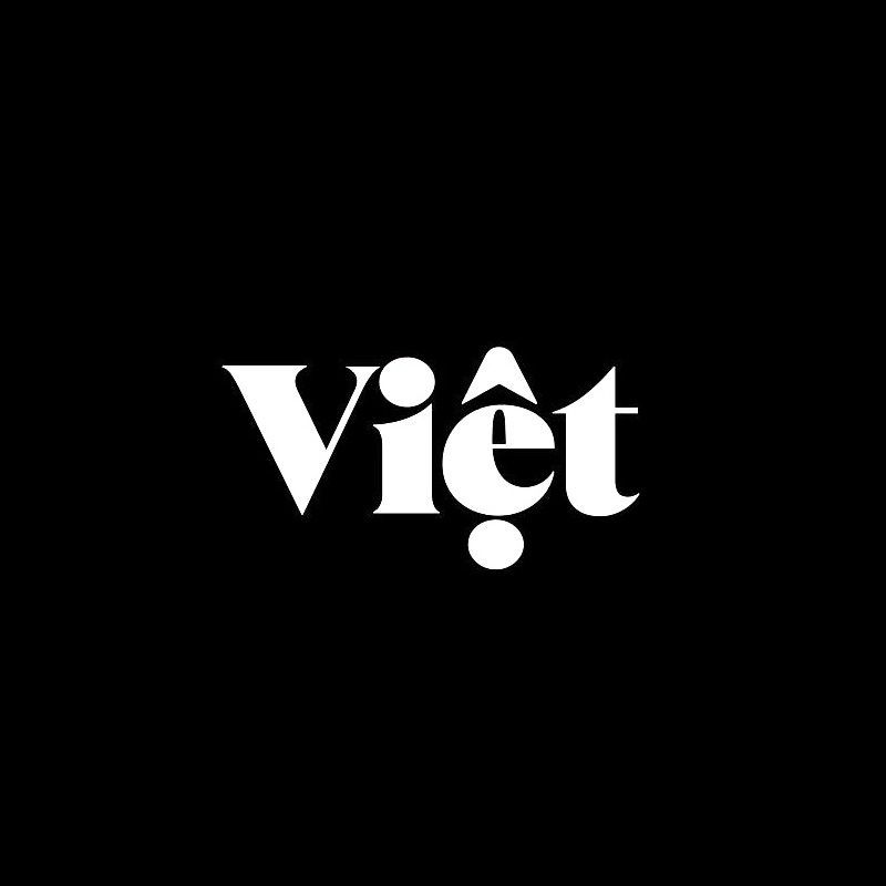
I’m writing to you from Vietnam today. This is my fourth time in this country, and somehow it feels like the first time I’m actually seeing it.
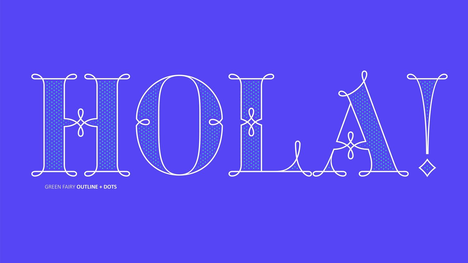
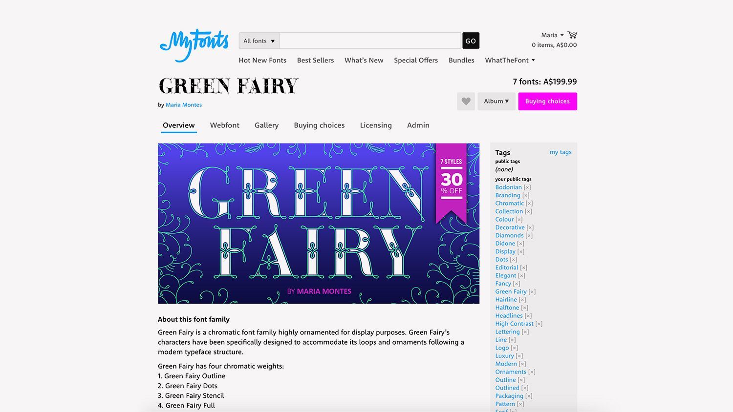
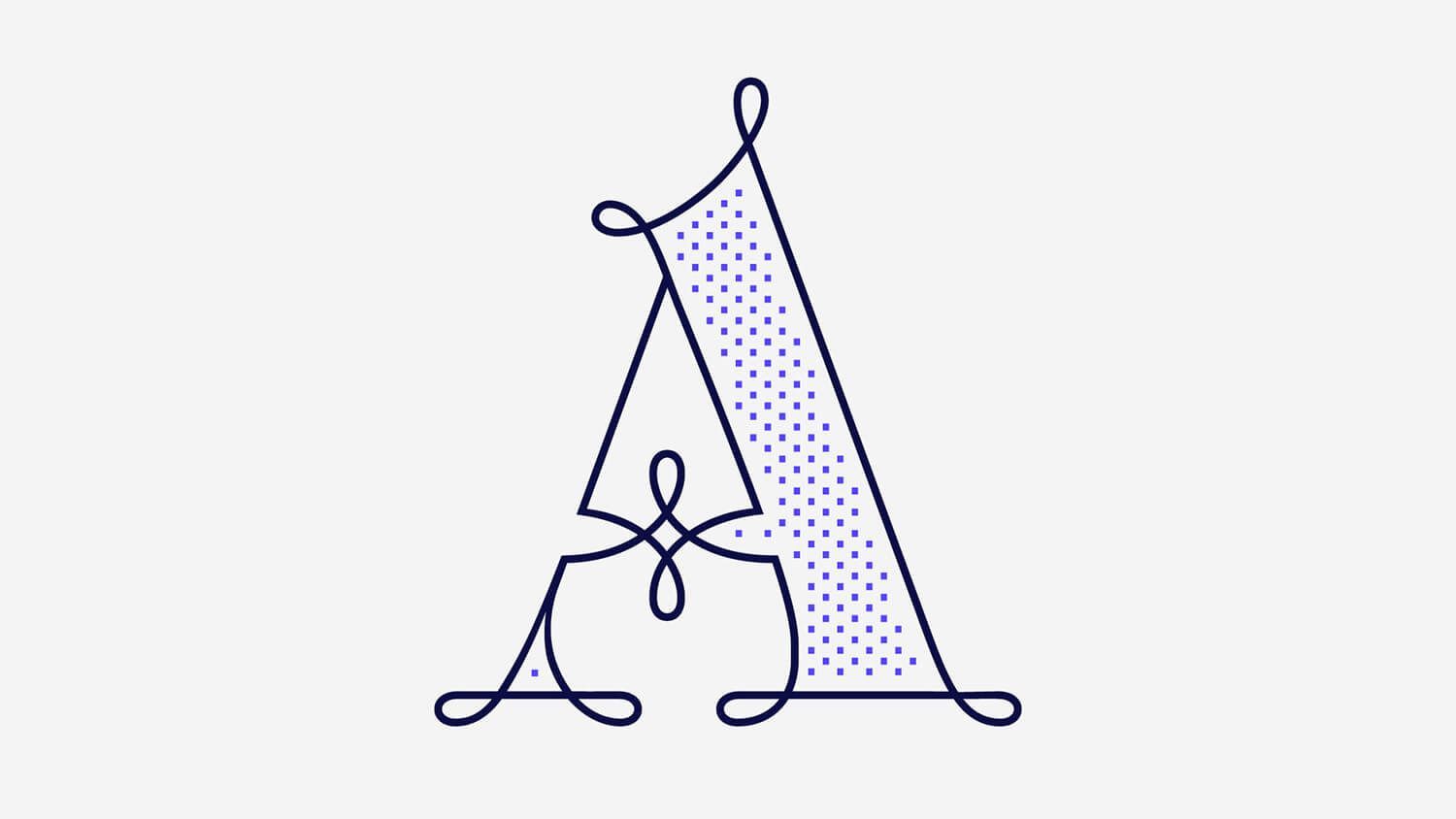
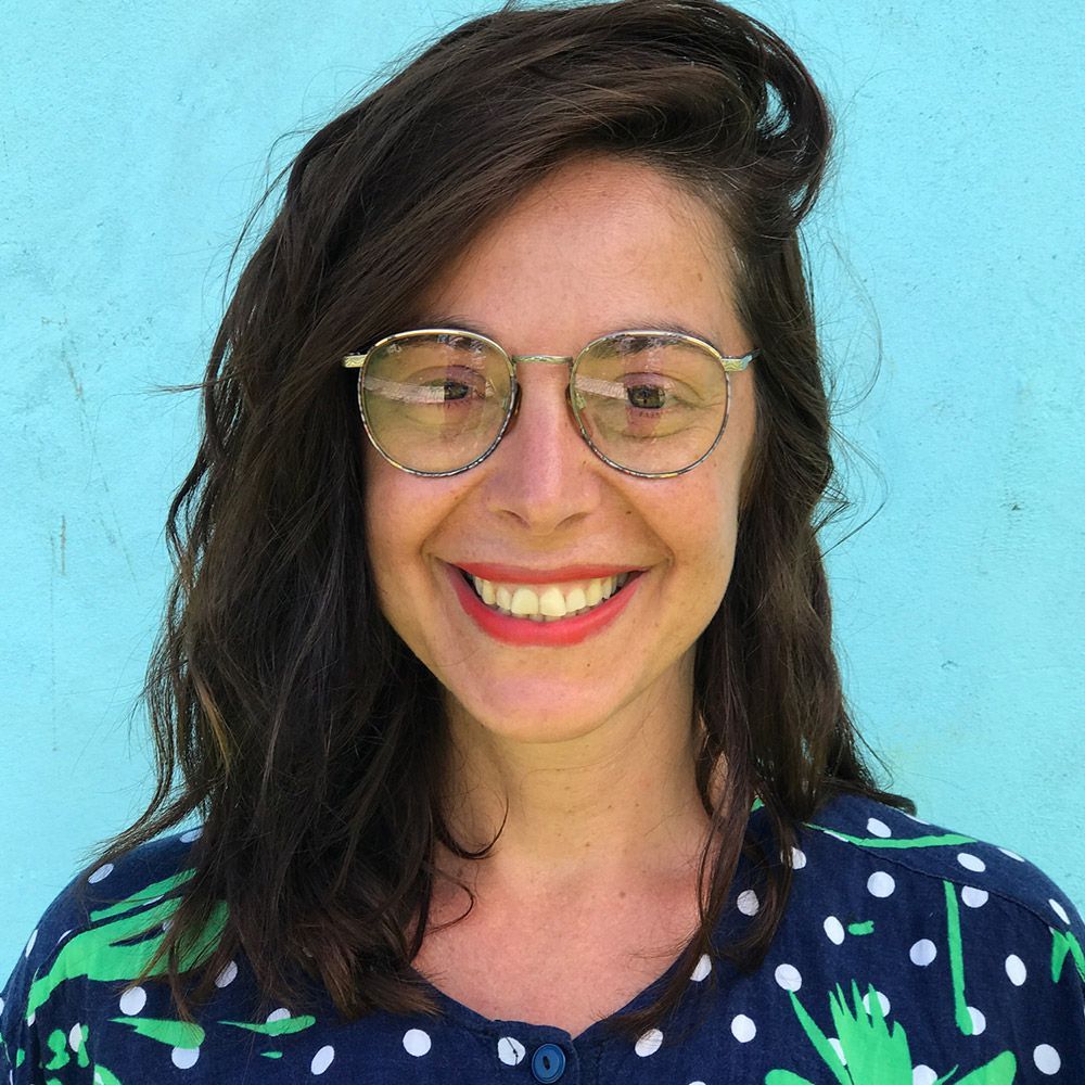
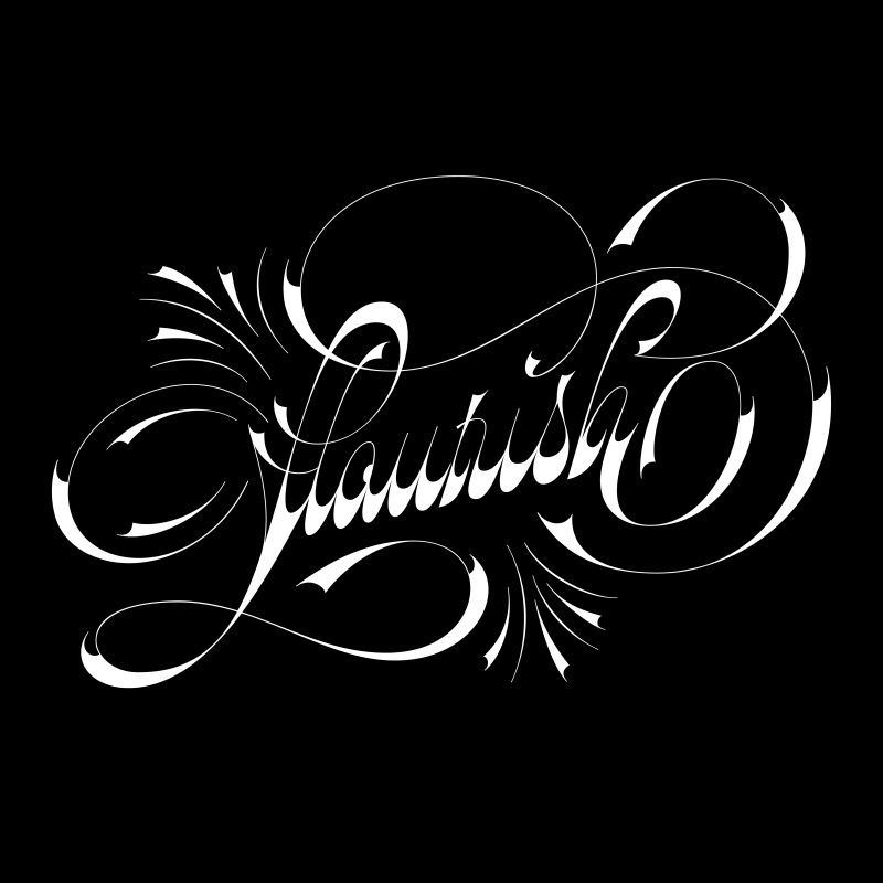
Maria Montes is a Barcelona-based type designer, calligrapher, and educator known for her expressive lettering and unapologetically honest creative voice.

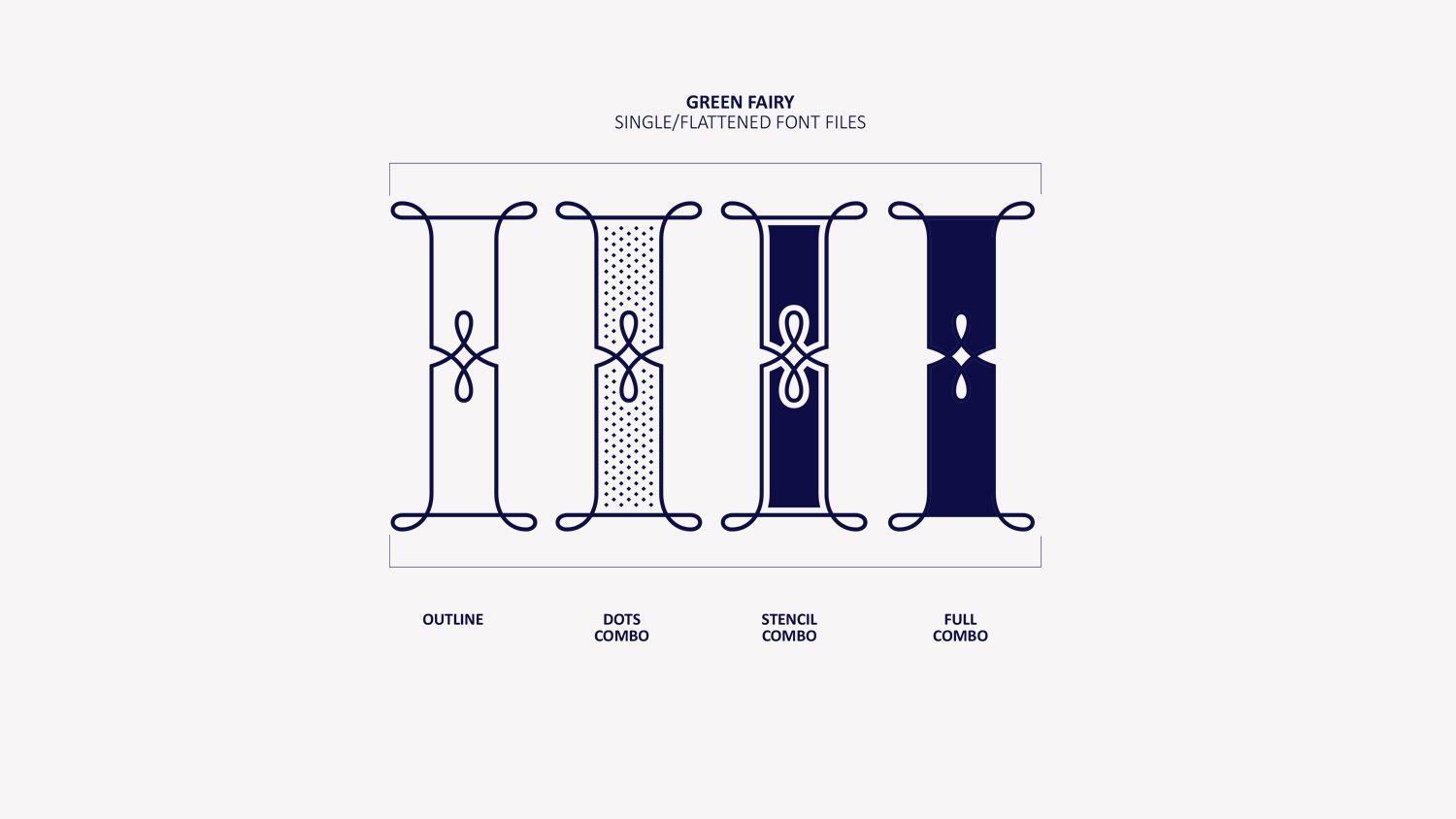
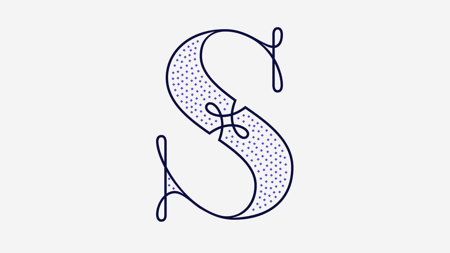
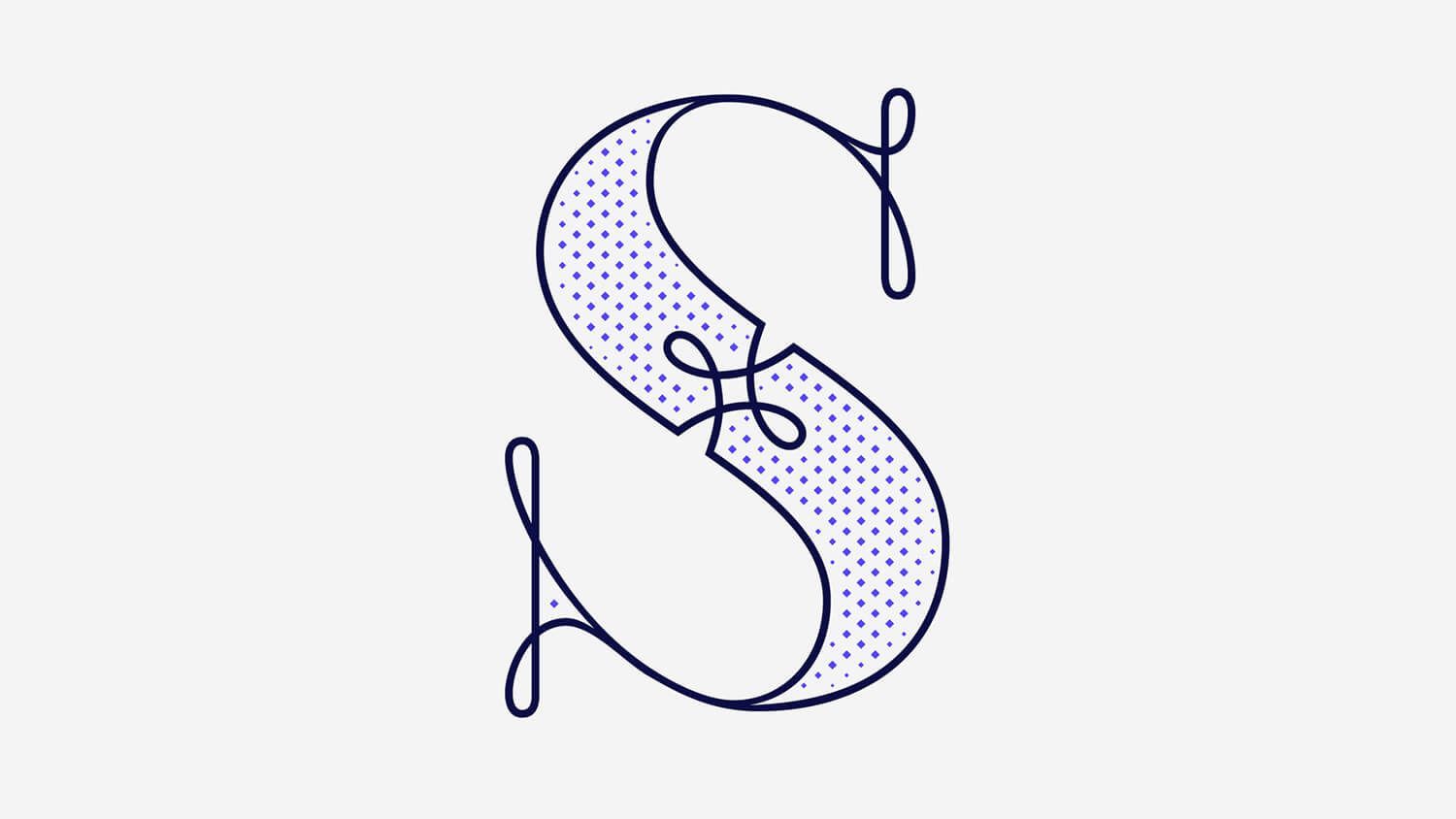
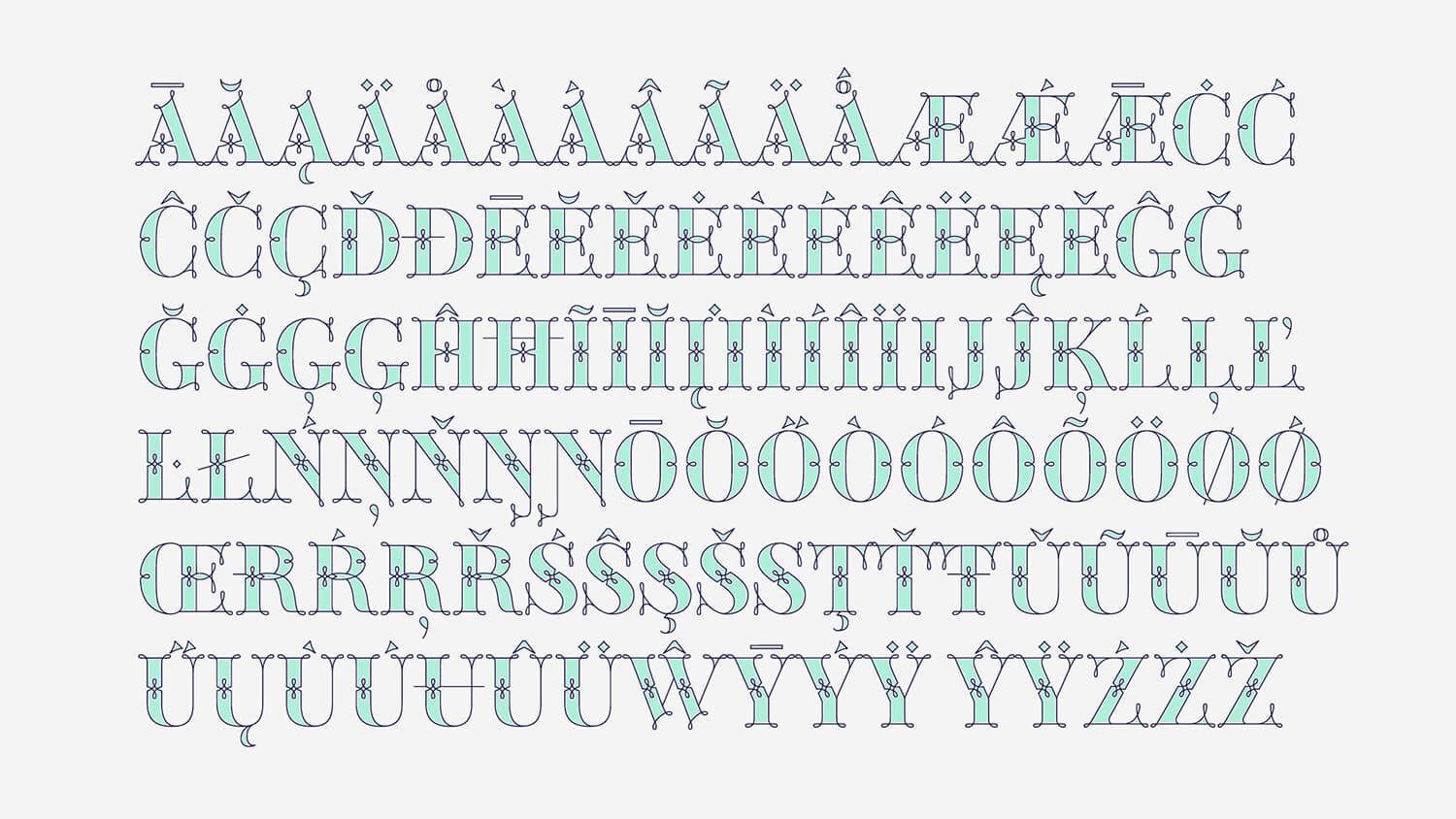
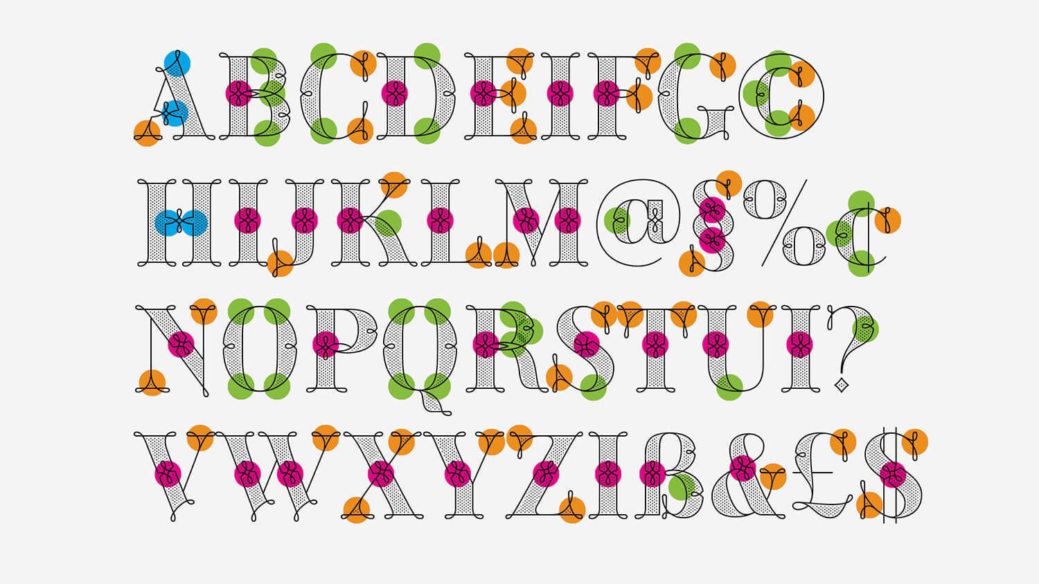
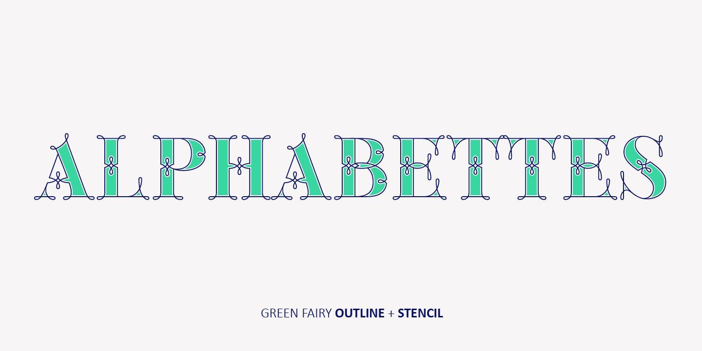
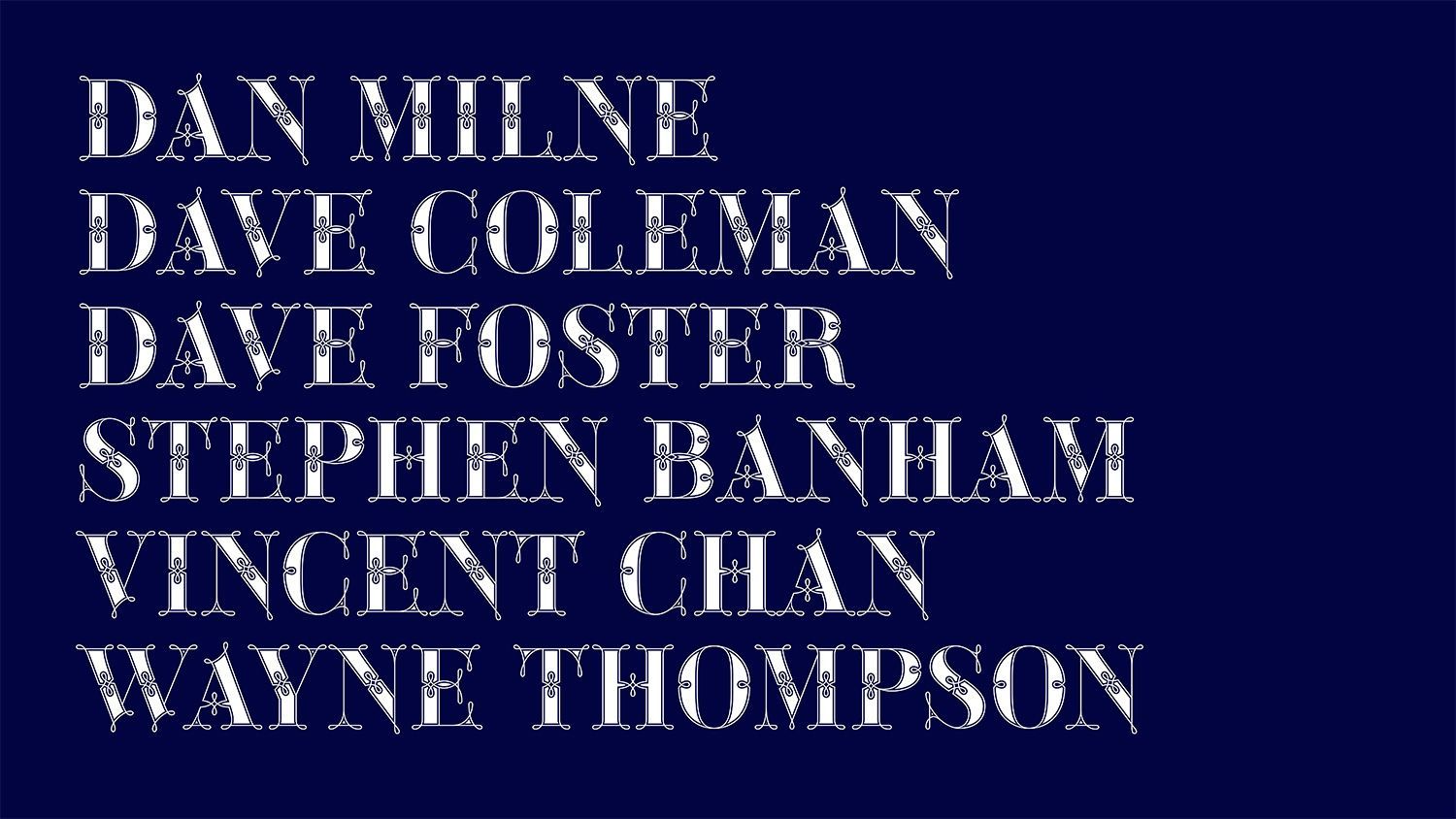
I’m really excited to share with you my second large project of 2025 called Kanat Latin! I’ve been developing this font for several months, and it wouldn’t have been possible without the trust and support of Lara Captan from Ama Foundry and my type mentor Jose Manuel Urós from Type-O-Tones.
The title of this monthly newsletter comes from Charli XCX, an artist who has given me a lot of the above over the past six months.
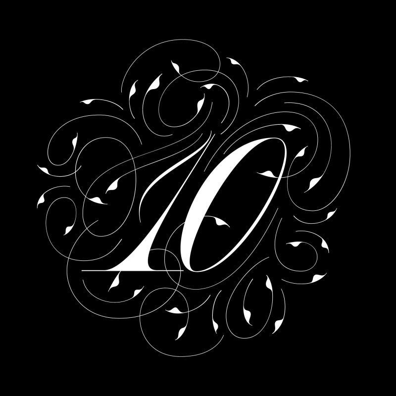
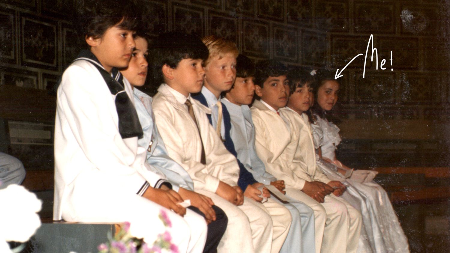
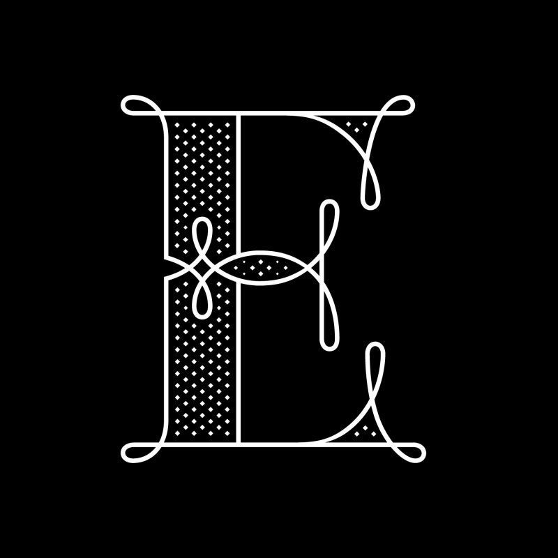
It’s November 2024, and I’m writing this article to celebrate my own 10th anniversary as an independent creative business of one.
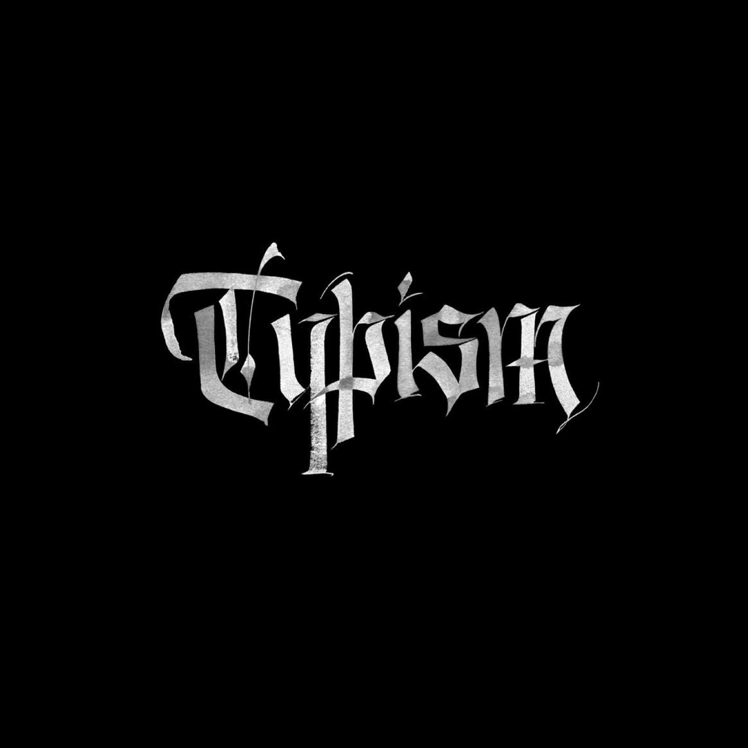
Recently, the Typism Community asked me a few questions about my lettering and design practice, and here are my insights.
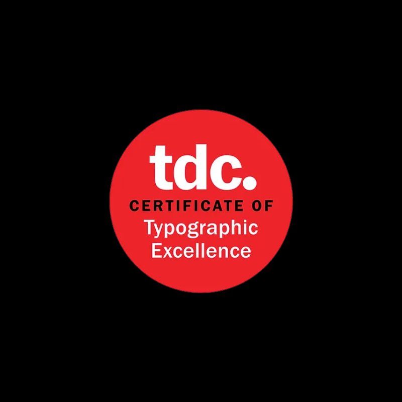
I’m really happy to share with you that the TDC 70 Type Directors Club has awarded my Calligraphic editorial for Middlebury Magazine commissioned by Pentagram.
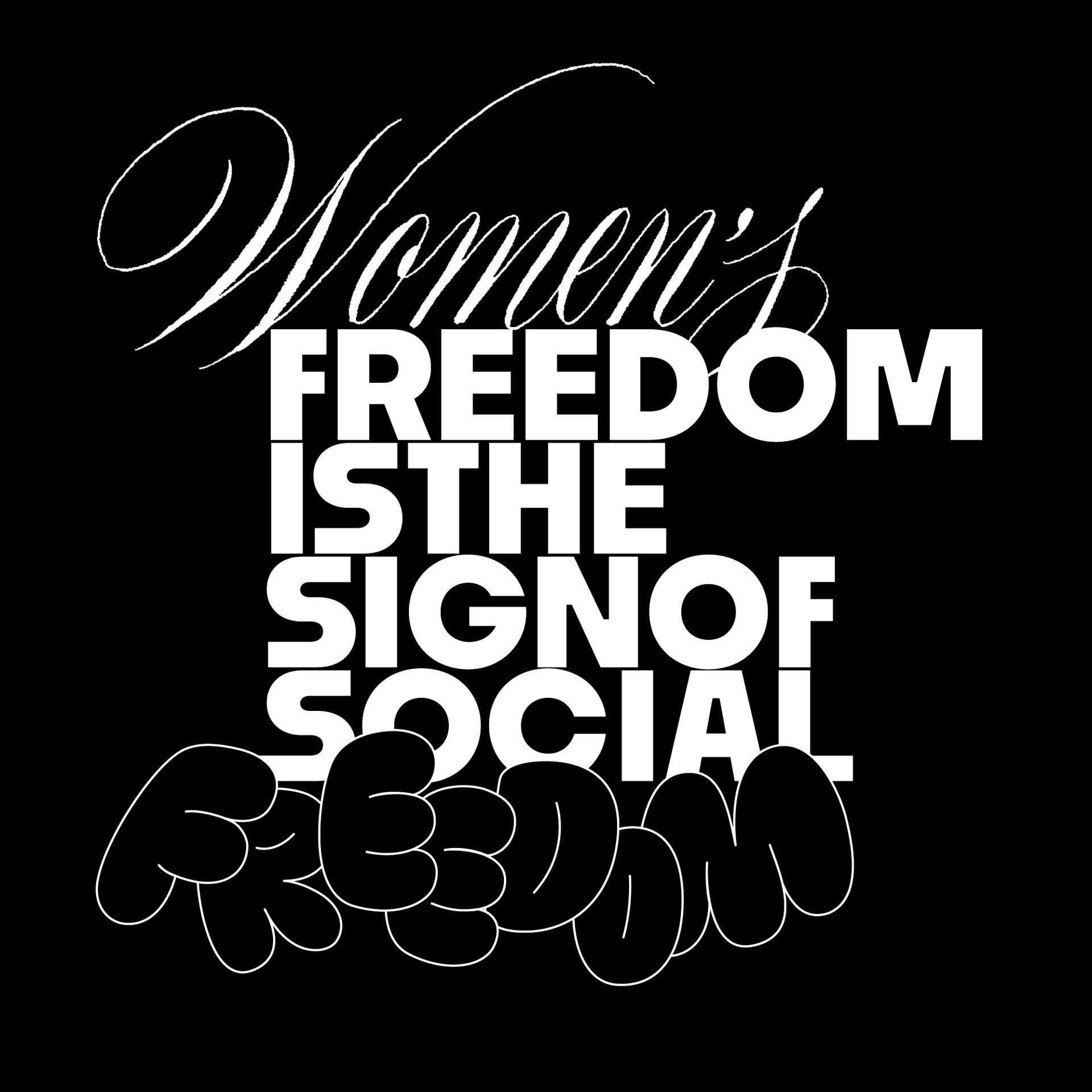
Feminism by definition is the believe that men and women should have equal rights and opportunities. It is the theory of the political, economic and social equality of the sexes.
Communications Arts (CA) Magazine informed me that the calligraphic editorial has won an award in the calligraphy/hand lettering category, yay!!
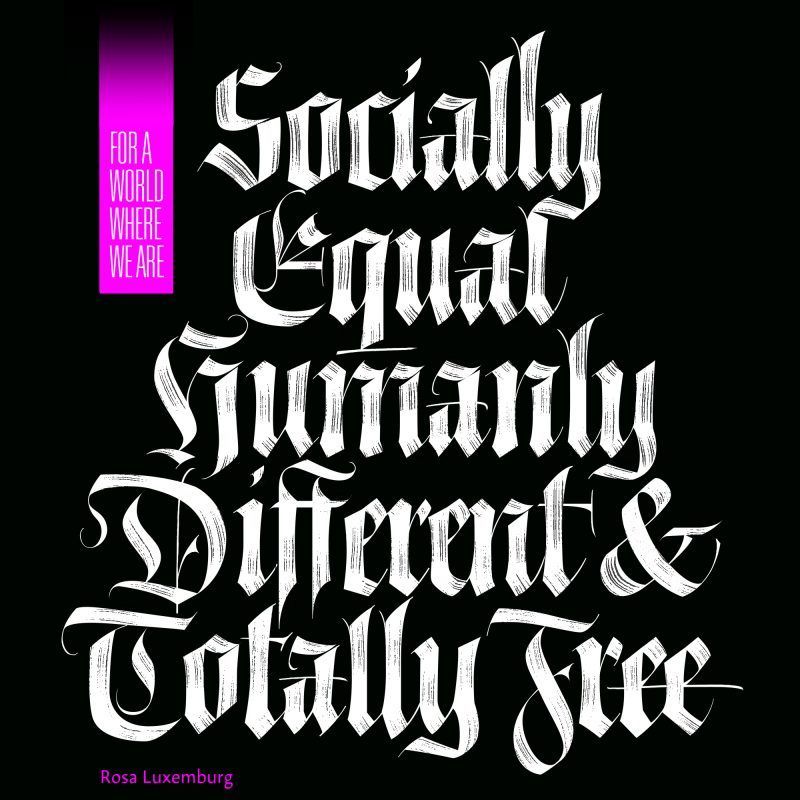
“International Women’s Day is not for celebrating. It is for protesting against and raising awareness about the fact that people are still being oppressed or treated differently because of their gender.” Greta Thunberg.

This article was originally written in January 2022, as part of a report called “Belonging” curated, designed and produced by We Are Tank.
In 2019 while I was teaching at RMIT University, I explained to my visual communication students that graphic design has a lot to do with cooking.

Protecting Australia’s First Languages is a fundamental part of preserving culture.
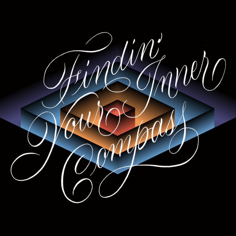
Dominique Falla asked me to be part of Typism’s podcast series, and talk about the concept of inner compass. I hope the notes I prepared for our interview are valuable for other designers in the visual communication field.
This interview was published on The Heroine’s Journey Website by Peter De Kuster.
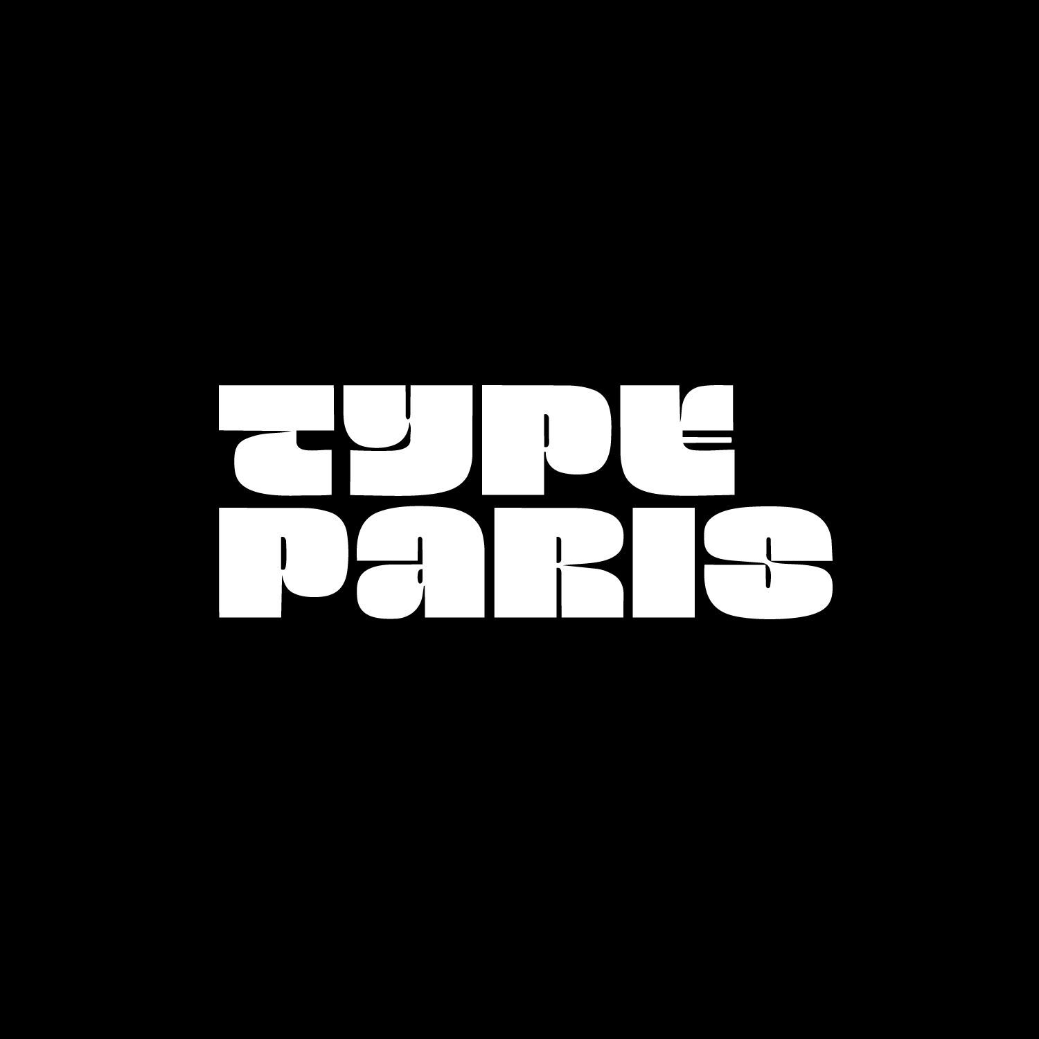
We have Maria Montes sharing with us this year at TypeParis. We wanted to find out a little more about her, so have presented a series of questions which she has generously taken the time to answer.

Happy International Women’s Day from a very proud multilingual, multicultural, independent female voice.
A while ago, I listened to an interview with Tim Ferriss in which he talks about “The Jar of Awesome”. If you —like myself— have One Bad experience and...
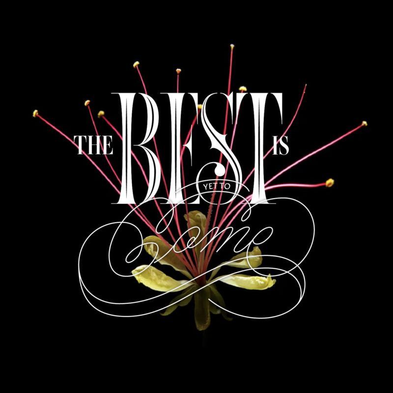
The Best is Yet to Come: Maria Montes Improves and Grows as a Freelance Designer, Illustrator, Letterer and Calligraphy Teacher. Interview by Nate Burgos...
A few weeks ago I was approached by a client who asked me to participate in a pitch…
In the lead up to my talk, I talked to The Design Conference Brisbane and answered a few questions.
In honour of International Women’s Day 2018, and in solidarity with women in Spain, I want to show my face and give my support to ALL creative women out there.
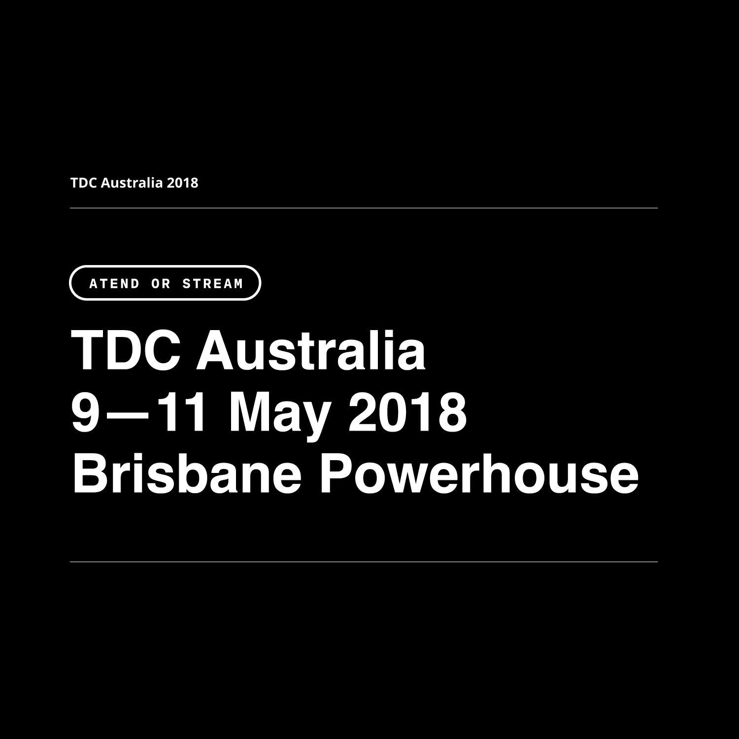
Living in Australia is awesome but one of the toughest moments during the year is when the “type conference season” starts. If you —like me— suffer of major FOMO...
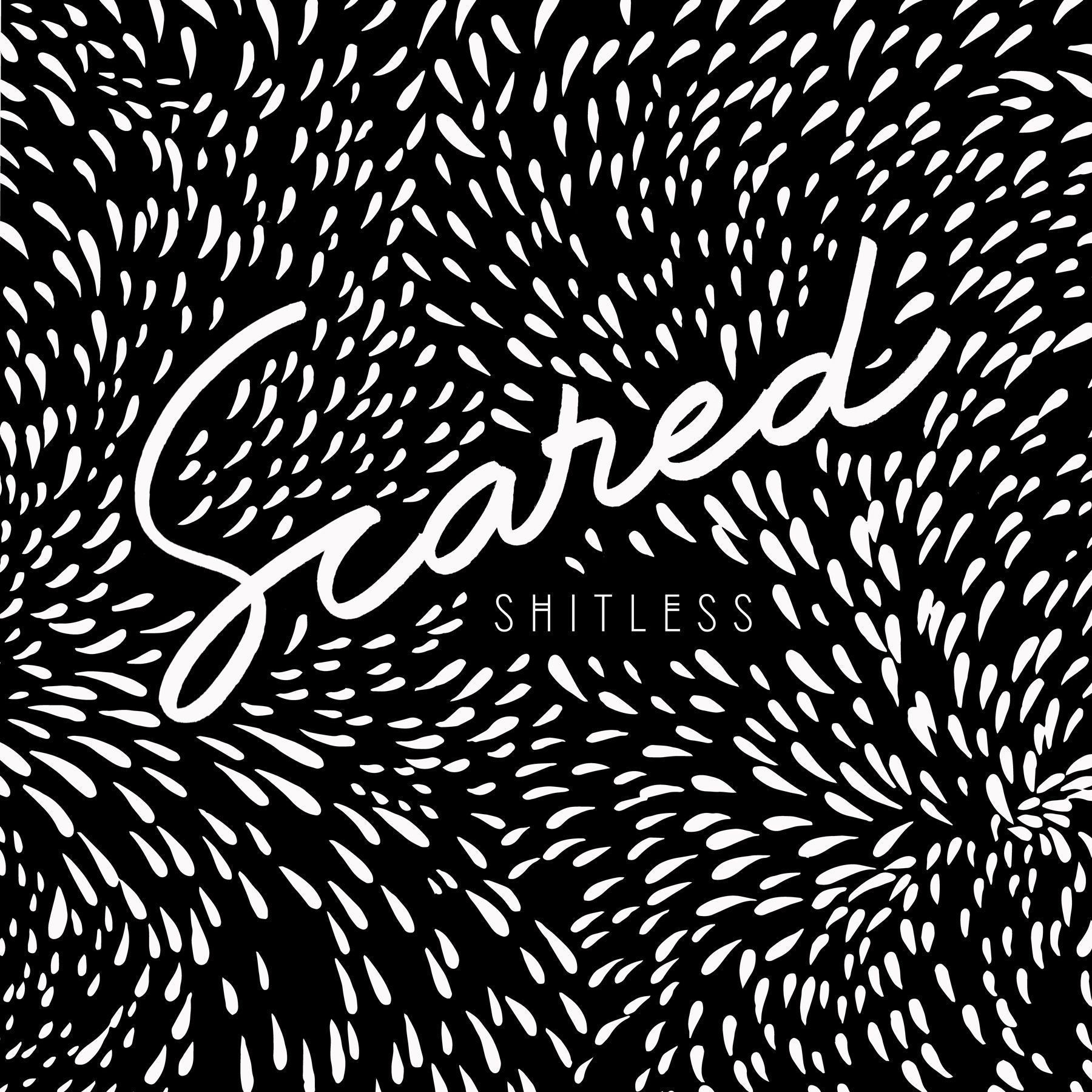
This is the transcript of my talk at TYPISM Conference on September 30, 2017. The talk is about facing fear and getting out of your comfort zone.
The life of contemporary women is complex, multifaceted, sometimes challenging, sometimes overwhelming yet also brimming with opportunity.
In 2012 I discovered a great hidden treasure in Fitzroy North (Melbourne) called Renaissance Bookbinding.
In April 2026, I closed a fully remote chapter, and decided to update this visual presentation with everything that I have learned since 2022 —which is a lot!
My seven-year-old grandson sleeps just down the hall from me, and he wakes up a lot of mornings and he says, “You know, this could be the best day ever.”
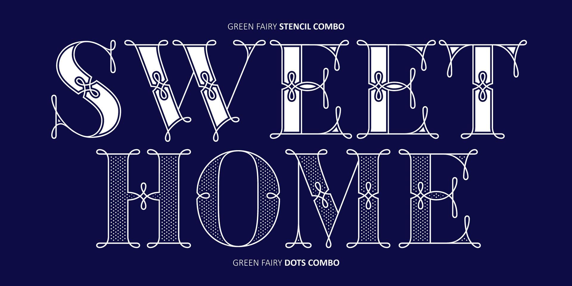
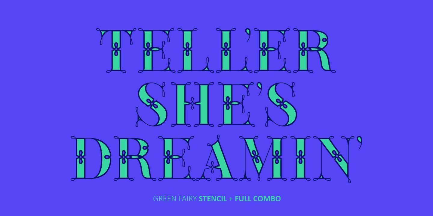
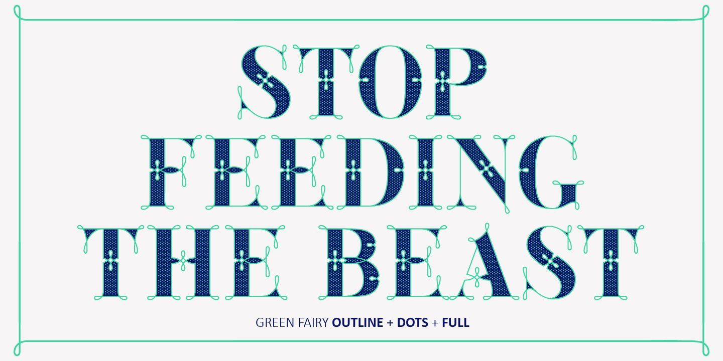
This article is an ongoing resource of fonts designed by women, as well as supporting material to learn more about female and non-binary graphic & type designers.
Barcelona for graphic designers is my on-going list of resources for any creative visiting this city for the first time(s). Every recommendation is only personal, and it comes with its location and a hyperlink to their website, Google map or Instagram account.
I’m writing to you from Vietnam today. This is my fourth time in this country, and somehow it feels like the first time I’m actually seeing it.
Maria Montes is a Barcelona-based type designer, calligrapher, and educator known for her expressive lettering and unapologetically honest creative voice.
I’m really excited to share with you my second large project of 2025 called Kanat Latin! I’ve been developing this font for several months, and it wouldn’t have been possible without the trust and support of Lara Captan from Ama Foundry and my type mentor Jose Manuel Urós from Type-O-Tones.
The title of this monthly newsletter comes from Charli XCX, an artist who has given me a lot of the above over the past six months.
It’s November 2024, and I’m writing this article to celebrate my own 10th anniversary as an independent creative business of one.
Recently, the Typism Community asked me a few questions about my lettering and design practice, and here are my insights.