Absinthe, The Green Fairy | Illustrated Cocktail Artwork
Absinthe, The Green Fairy | Artwork
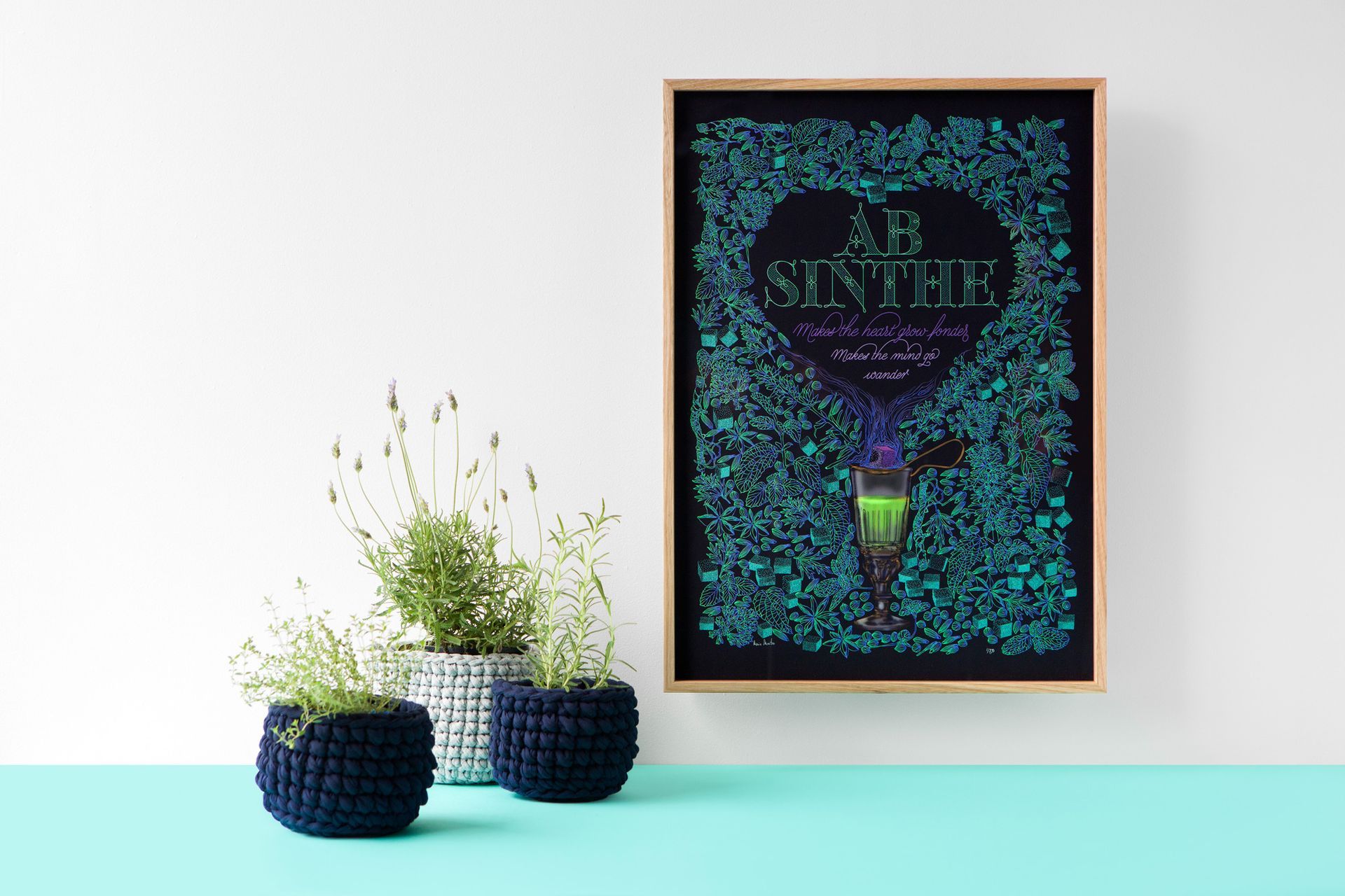
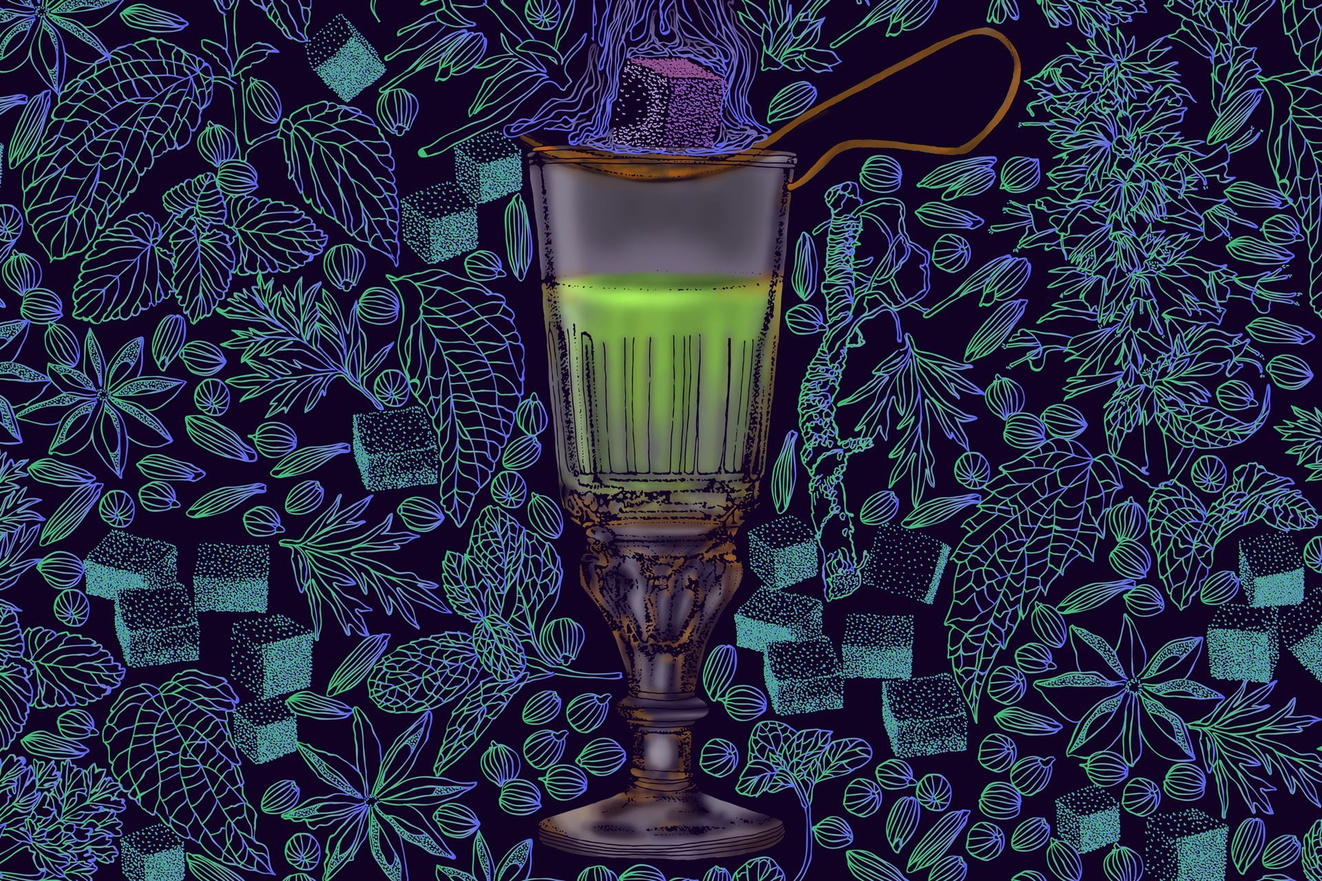
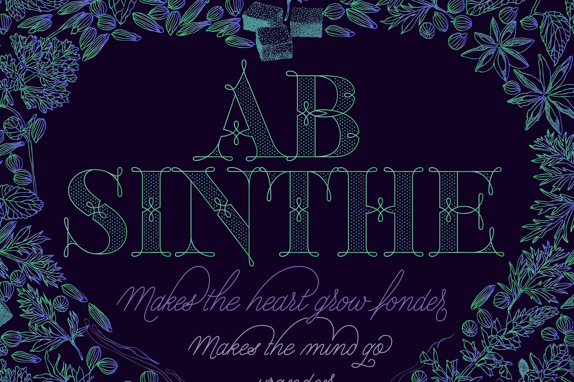
This is my seventh illustrated cocktail artwork called Absinthe, La Fée Verte (The Green Fairy). This lettering artwork wants to glow in the dark and keep us on dreaming.
The origins of the Absinthe drink
Henriette Henriod, often called ‘Mother Henriod’, said that she had always been aware of the medical benefits of wormwood. In the second third of the 18th century, she produced an elixir made of wormwood in her hometown in Couvet, Switzerland, which was used to cure various diseases. […]
With the beginnings of the industrial production of absinthe, it was decided, that it was necessary to modify the recipe of the wormwood elixir to satisfy the growing number of customers.
The bitterness was reduced through:
– using less wormwood in the recipe
– using more anise and fenne
Absinthe | Design Process
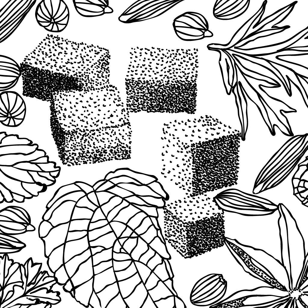
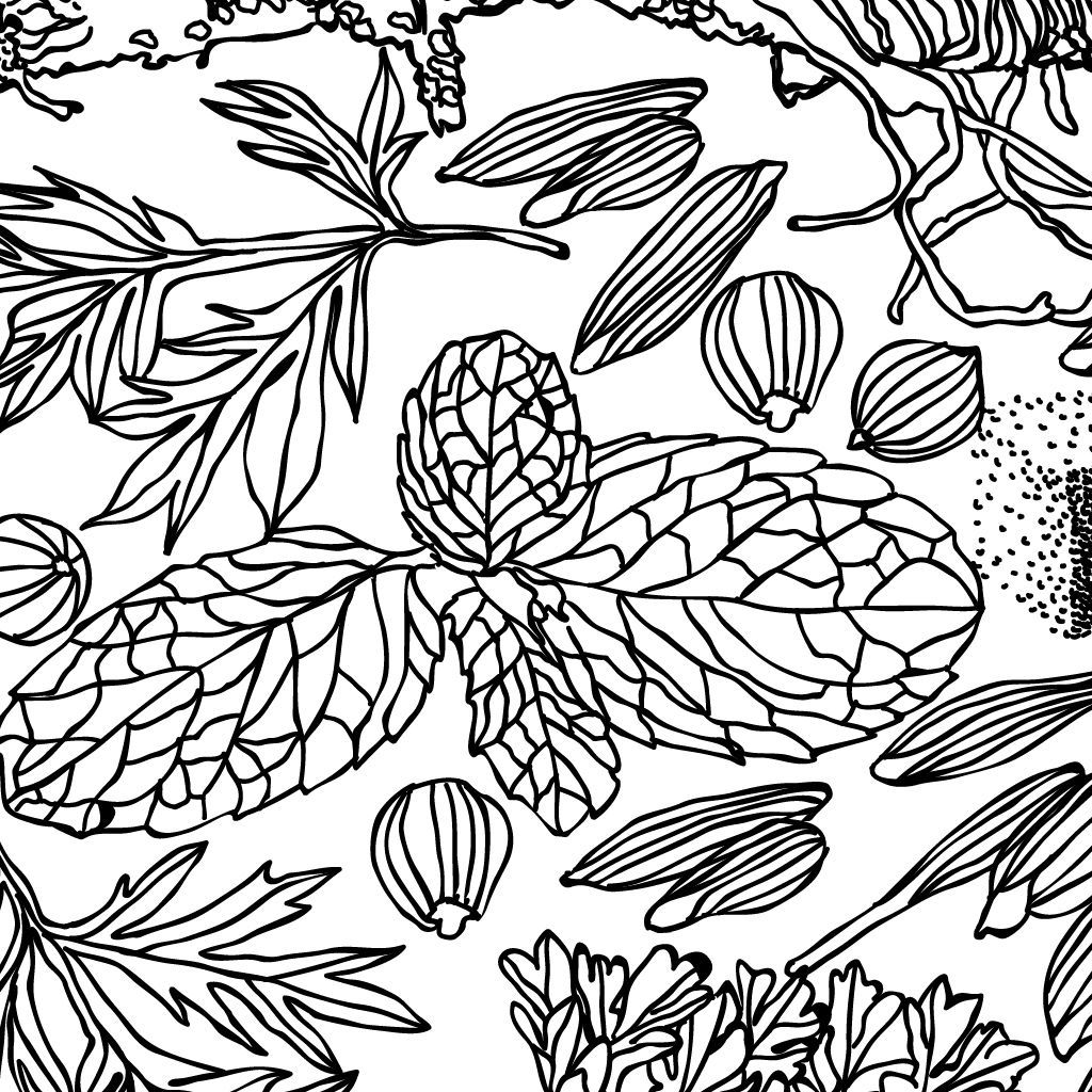
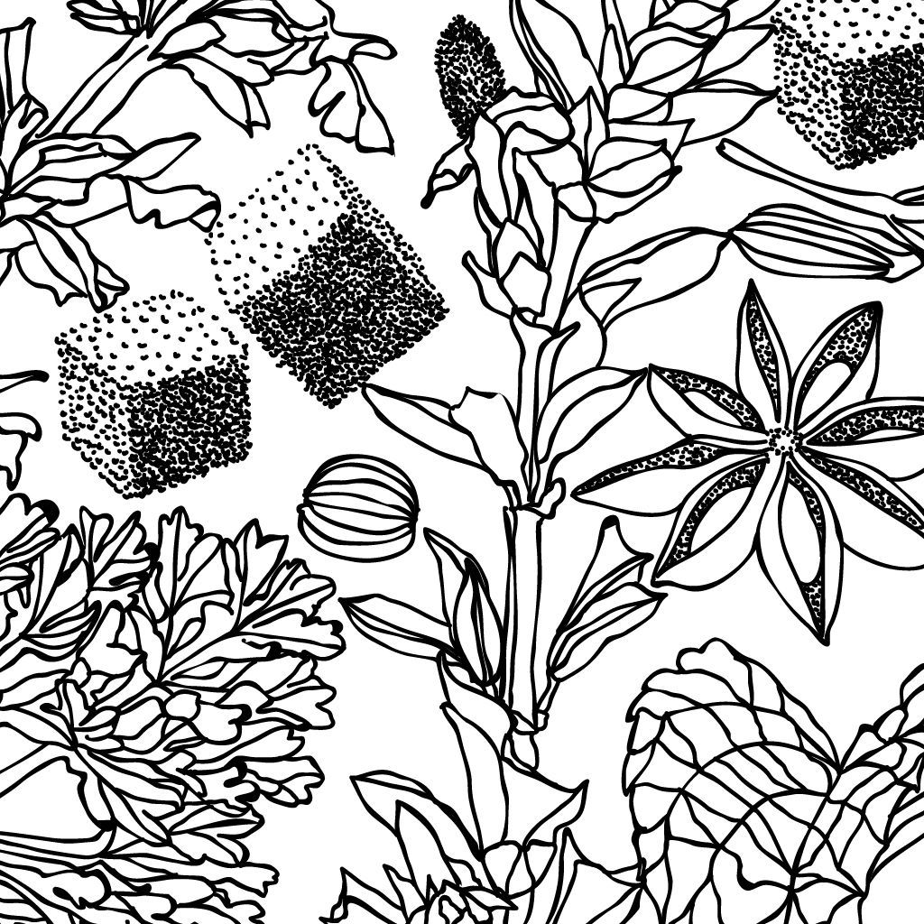
Doing further research on the Absinthe formula, I found a informative post from Wikihow.com. Following Wikihow recipe, I began to draw the ingredients involved in the formation of Absinthe: Wormwood, hyssop (whole plant), Chinese star anise (fruit/flower), anise seeds, fennel seeds, lemon balm, coriander and thyme.
The colour palette of this artwork is clearly inspired by the popular Green Fairy name associated with Absinthe. I wanted to create a glowing visual experience.
All the elements of this piece have been vector drawn, except for the green spirit in the glass.
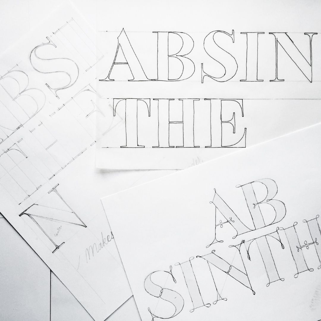
Absinthe Lettering
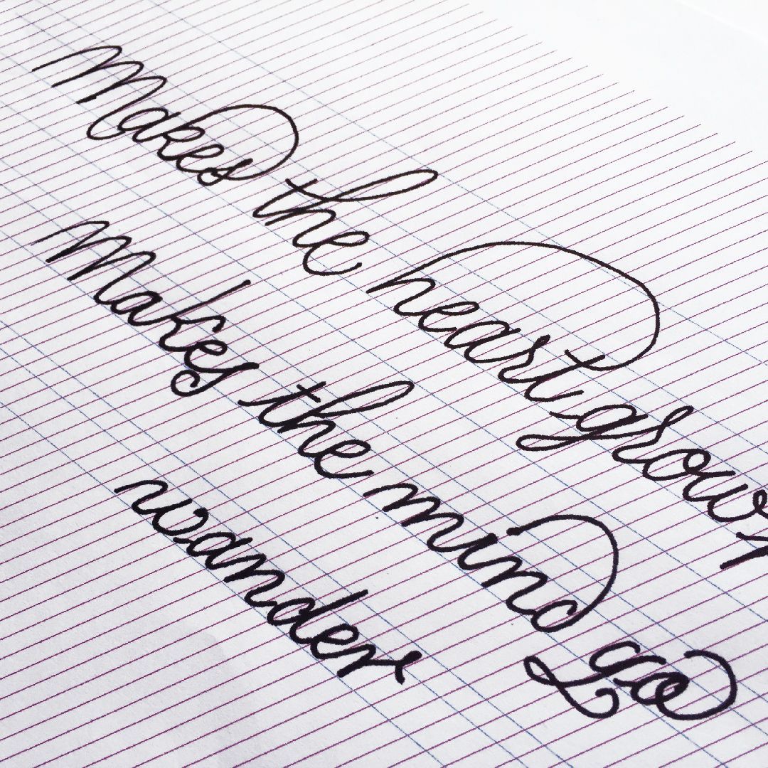
The message of this piece arose from a brainstorming session with my colleagues, Tim Allan and Sarah Graham at Rotson Studios.
Sarah suggested the idea of replacing absinthe by absence in the popular saying “absence makes the heart grow fonder”; and Tim added the poetic sentence “absinthe makes the mind go wander”. I loved both ideas so I started working on them straight away.
Ab·sinthe
The reason behind the breaking up of the word ab·sinthe in my artwork lies in the relationship between the meaning of the Latin prefix, ab– (which means away) and the fact that I replaced the word “absence” by “absinthe” on the piece, so it all made sense.
Services
Illustration
Lettering
Surface pattern design
Original artwork