Green Fairy | Spirits Labels Design
Liquors | Packaging Design Concepts
Green Fairy Font Origins
Green Fairy is a chromatic font family highly ornamented for display purposes. Green Fairy’s characters have been specifically designed to accommodate its loops and ornaments following a modern typeface structure.
The origin of this typeface is the lettering I designed in 2015 as part of my illustrated cocktail artwork called Absinthe. La Fée Verte (The Green Fairy). Originally, this lettering only featured eight letters “AB·SINTHE” vector drawn in Illustrator.
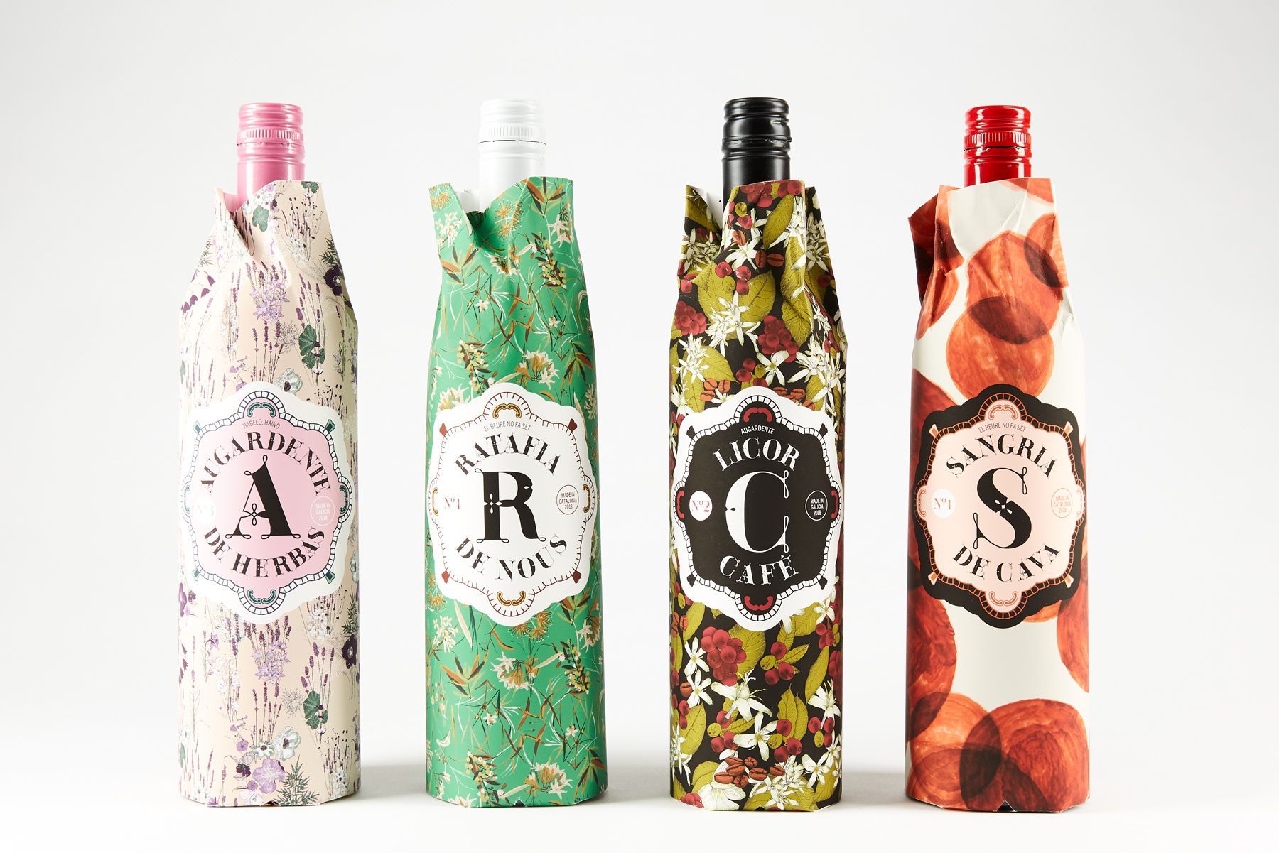
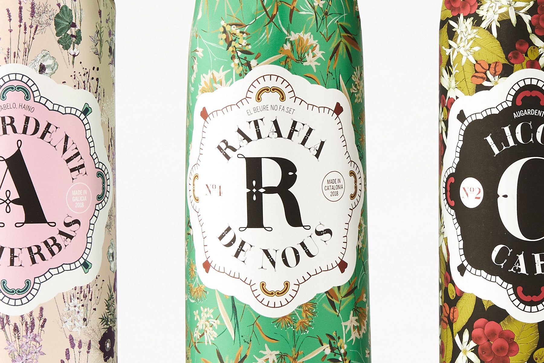
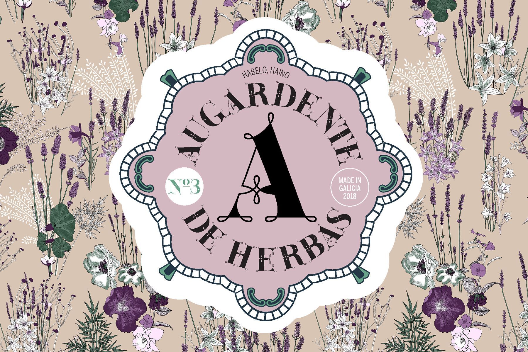
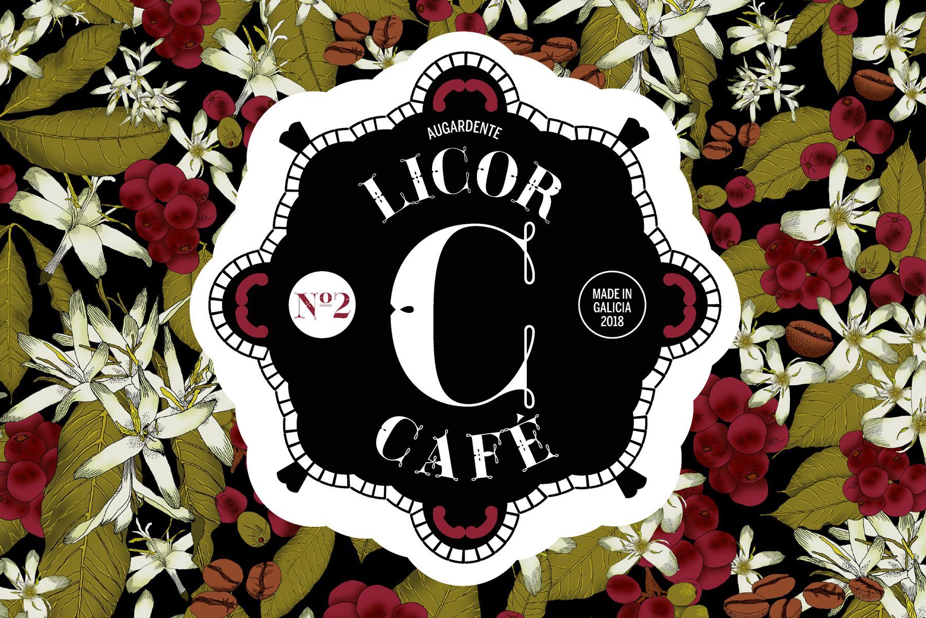
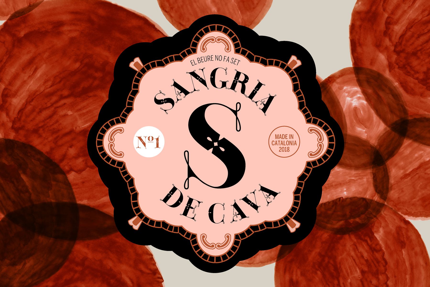
Green Fairy Packaging DESIGN Concepts
In April 2018, Green Fairy font family was finally released commercially at
MyFonts. In June 2018, I presented Green Fairy Font officially at my second solo exhibition in Spain featuring nine different packaging design concepts to display the font in use.