Ciao Negroni | Illustrated Cocktail Artwork
A Mojito Made Me Do It
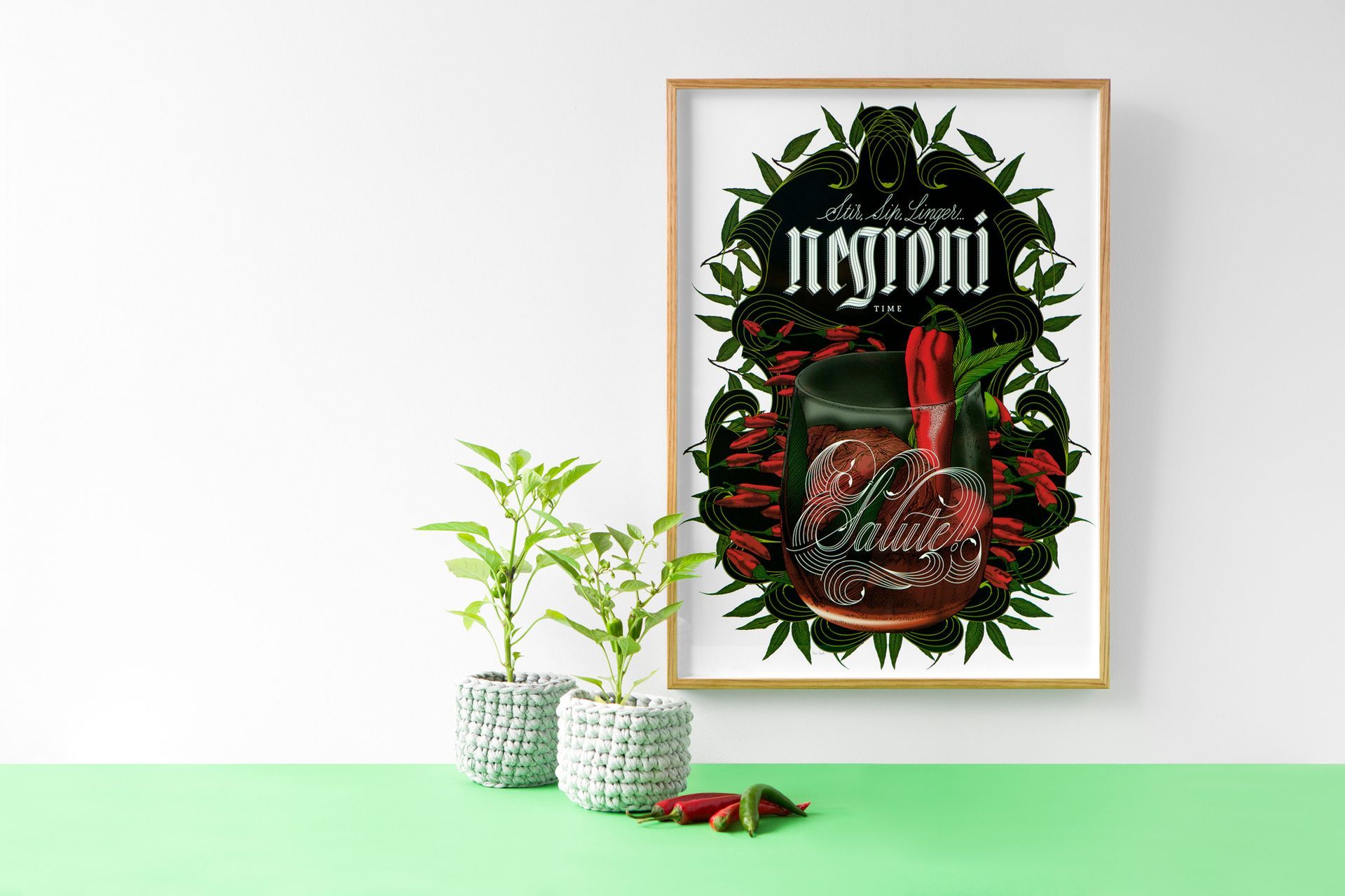
This is my sixth illustrated cocktail artwork called Ciao Negroni! featuring this classic Italian cocktail.
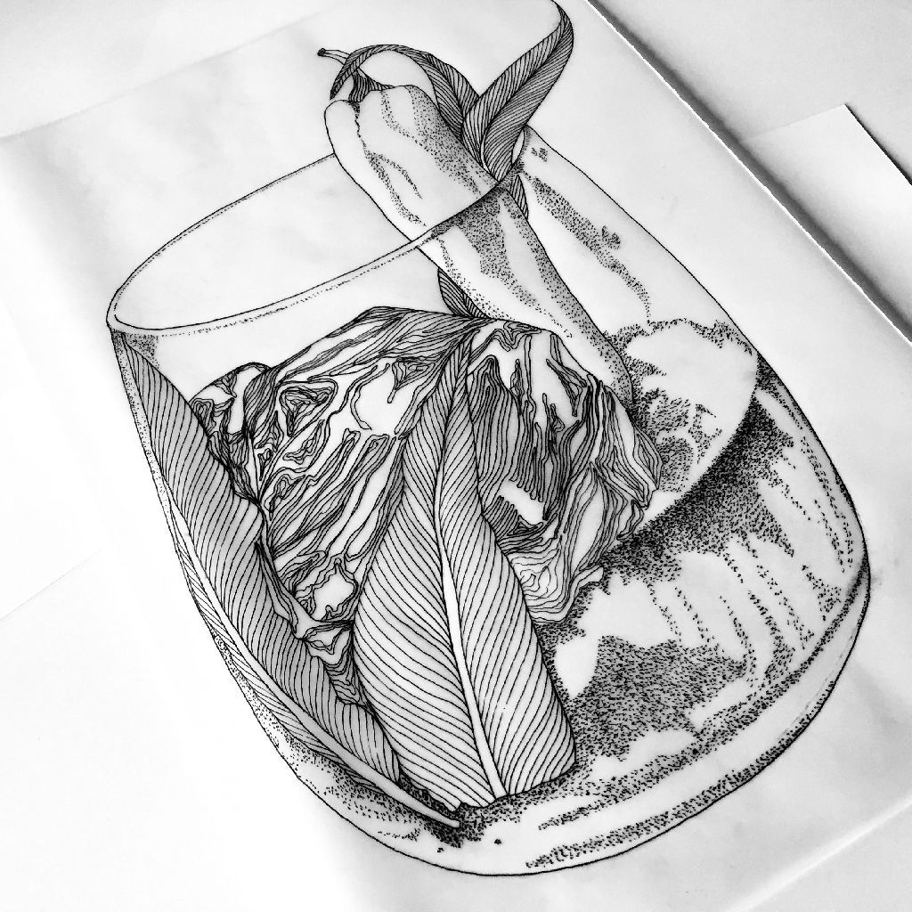
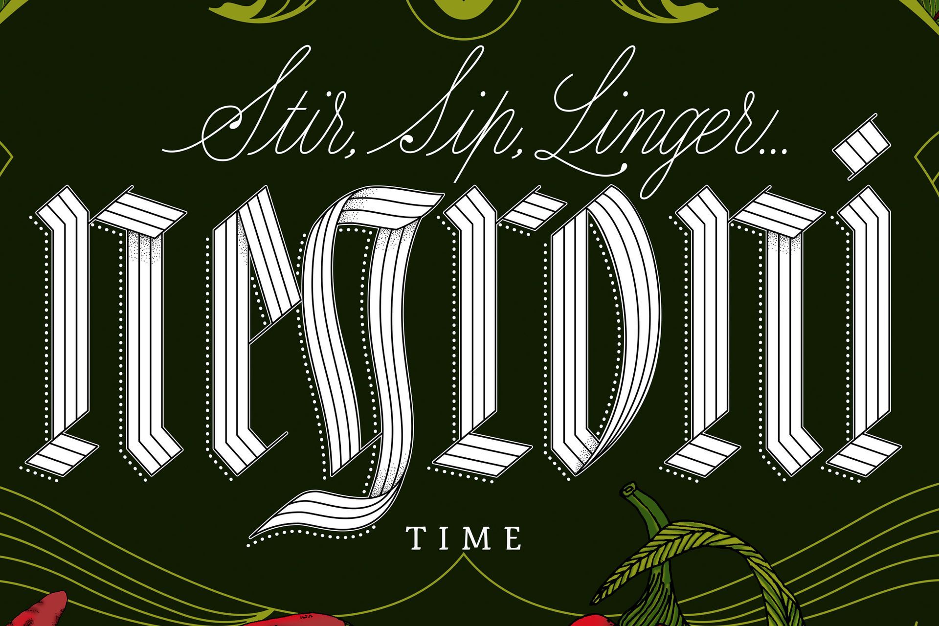
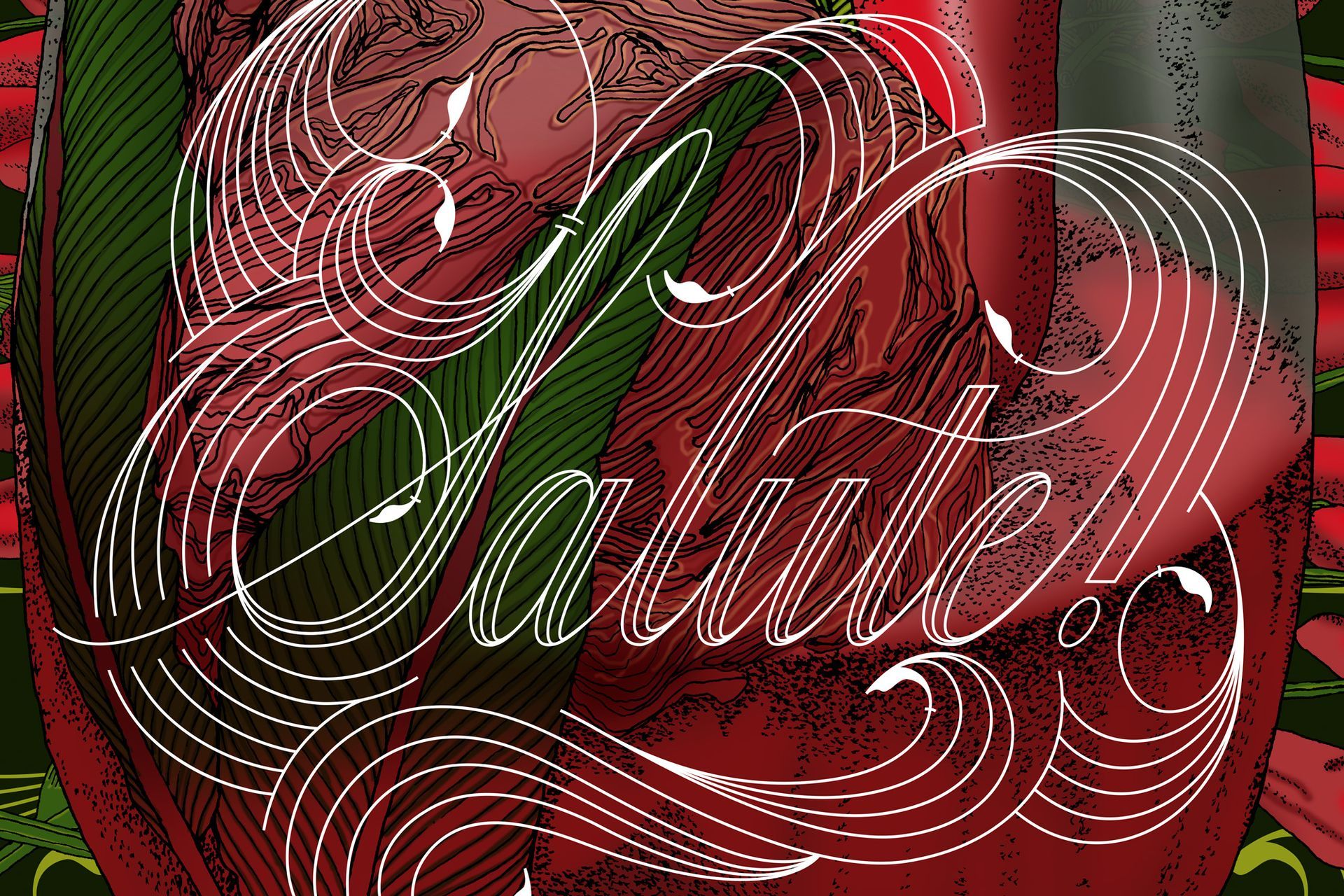
The artwork is an elegant interpretation of the Negroni drink combining red, green and white colours and featuring chillies, mint, a cocktail glass and sections of the lettering “salute!” as decorative elements to build its final shape.
NEGRONI RESEARCH
The inspiration behind this piece is a blog post from BonAppetit.com called “How to Drink like an Italian”. On this post, Bon Appetit restaurant and drinks editor Andrew Knowlton states:
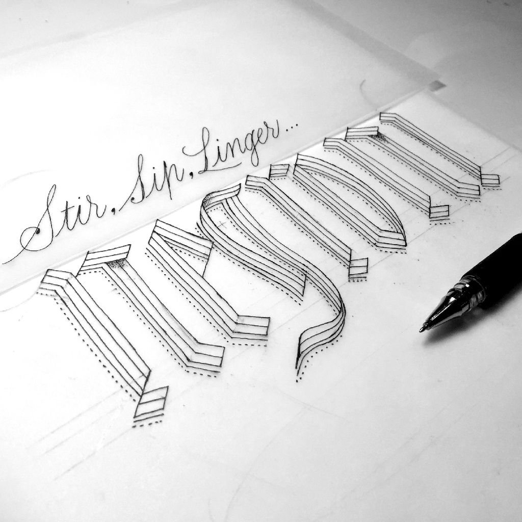
“Italians drink differently than we do. They sip, stir, linger over low-octane cocktails”.
Personally, I love Italy and as Jessica Webster says:
“How can you not love a culture that so lustily celebrates the finer things in life? Opera, art, fashion and food.”
Nieuw Amsterdam —where I hosted
my first solo exhibition— offers a variation on this cocktail called “Chilli-Chocolate Negroni”. I love chillies so I decided to go ahead with this version of the Italian drink.
Negroni Design Process
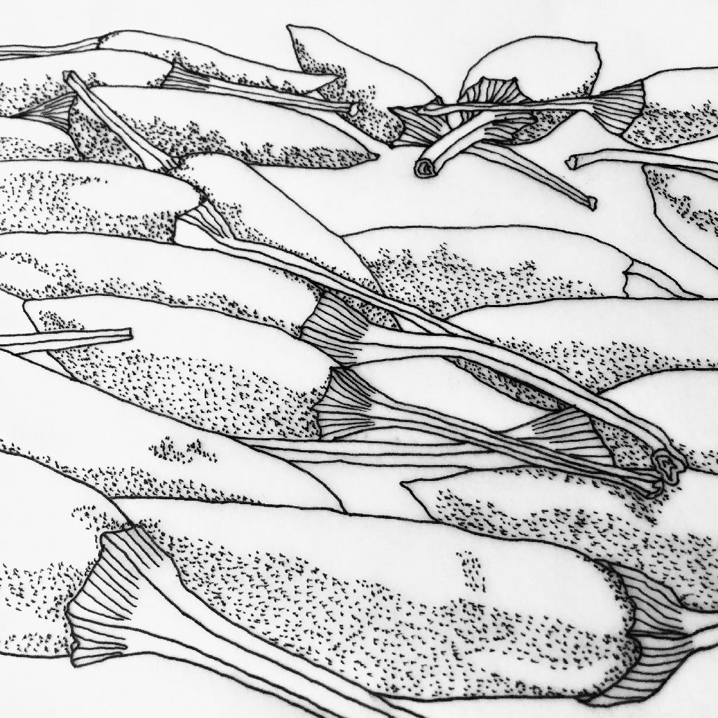
I wanted to use the colours of the Italian flag without being too obvious. Chillies gave me the red colour palette I needed, so I began to illustrate them as my starting point.
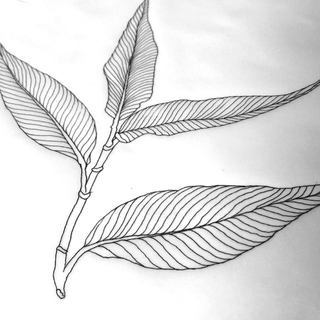
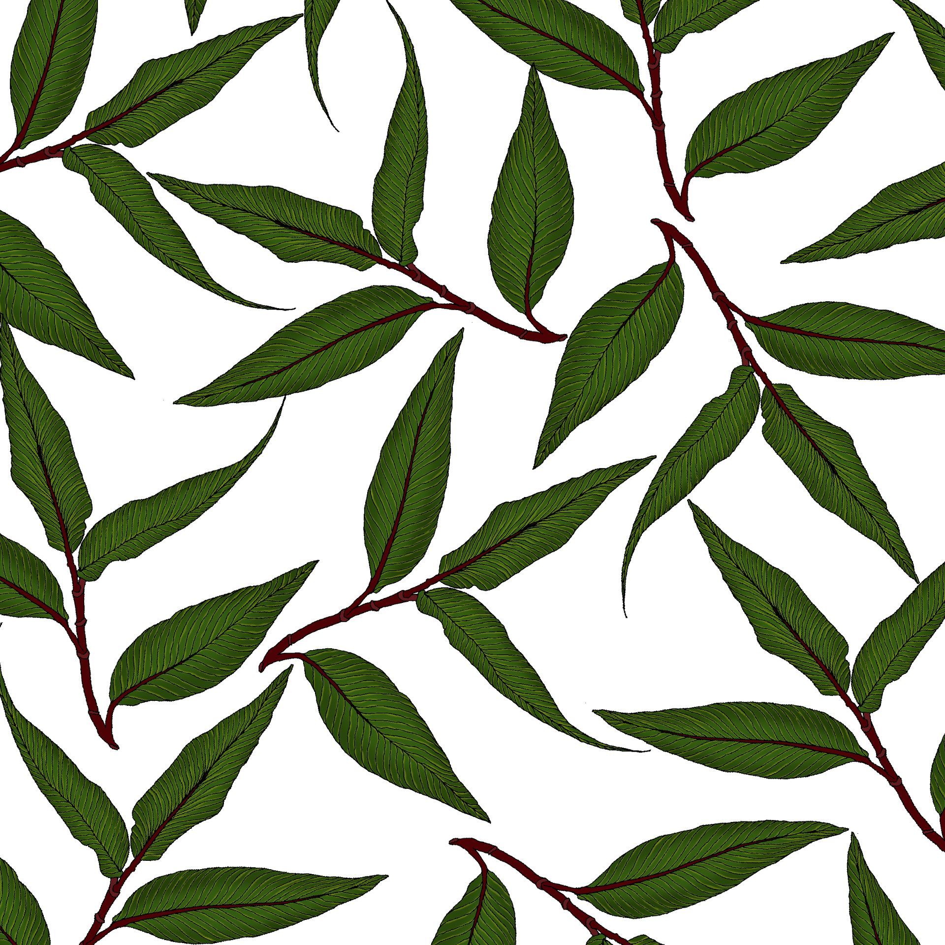
The other ingredient from Nieuw Amsterdam’s cocktail recipe is Vietnamese mint, which became the second main element in my Negroni artwork. All the ingredients have been drawn by hand and coloured in Photoshop.
Negroni Lettering
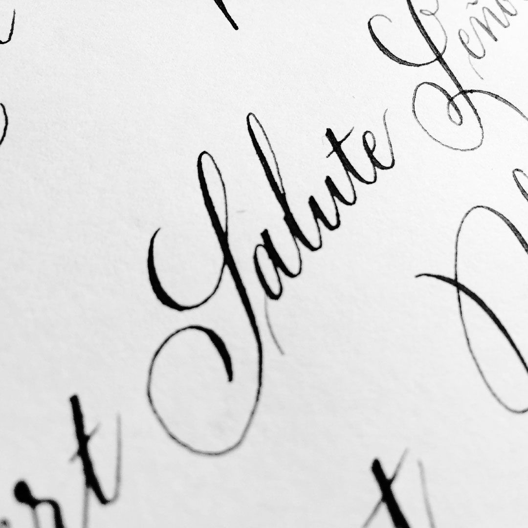
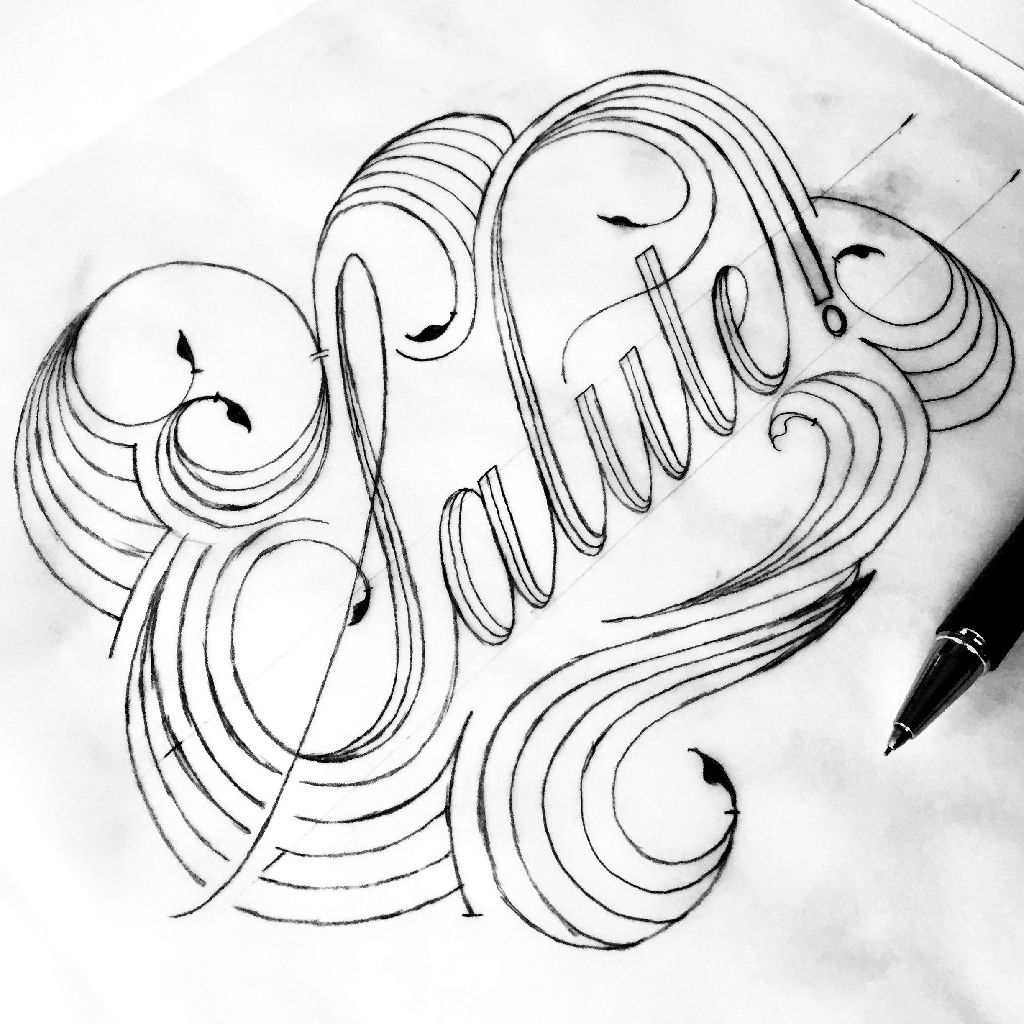
Following the Italian theme, I wanted to introduce an Italian word that could be easily understood in English, so I chose “Salute”. This lettering has been designed using my own Copperplate calligraphy as a reference.
On the other hand, “Negroni” is a custom lettering design based on my own Fraktur calligraphy.
Services
Illustration
Lettering
Surface pattern design
Original artwork